How to create clear and attractive graphs/illustrations?
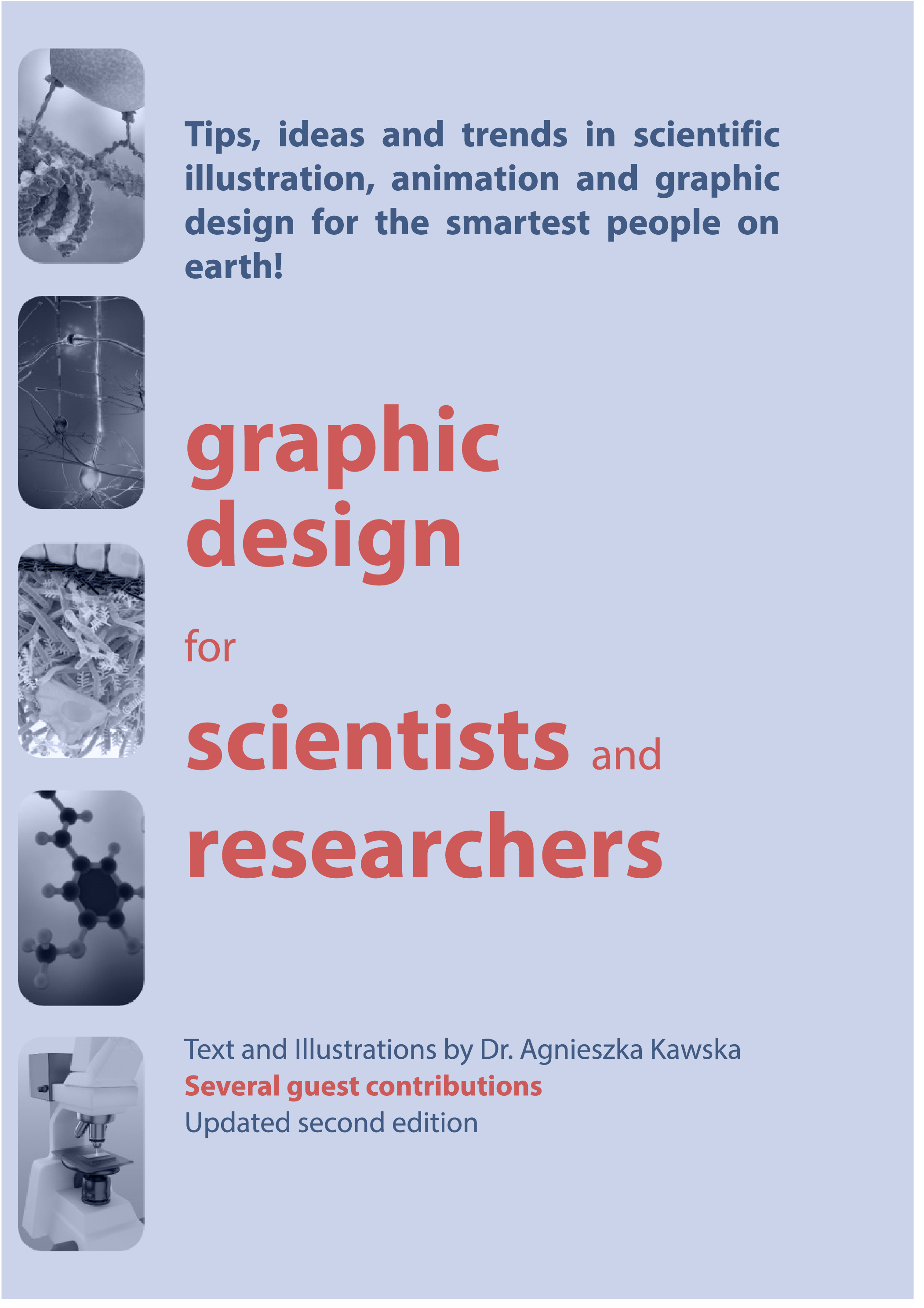
Pieter Torrez from Crastina and Scigrades had a quick chat with former scientist-turned-scientific illustrator Agnieszka Kawska who is the main author of the guide “Graphic design for scientists and researchers” . This free guide contains tips, ideas and an introduction to latest trends in scientific illustration and animation for the smartest people on earth. The interview gives you a foretaste of the guide’s content so, if you are interested, be sure to go and grab the entire document on her website (http://www.illuscientia.com/
 1. Hi Agnieszka! Tell me, what can scientist find in the guide ‘graphic design for scientists and researchers?
Firstly, the document can be viewed as a quick primer on the basics of graphic design, complementary to the already existing literature on graphic design and data visualization for research. It covers topics like preparing plots for publications and presentations, and gives general tips on using principles of graphic design in scientific figures, posters and presentations. Secondly the guide is an attempt to keep up-to-date with the currently fast developing trends in scientific communications like graphical abstracts, video abstracts and scientific animations. It also addresses modern topics like scientific images suitable for social media which have not yet been given much attention in the available literature. Overall the intention is to provide scientists with a reference for improving their visual communication skills.
2. Why should (young) scientists use the guide?
Scientific communication is recognized to be of crucial importance to scientists but it is still very often reduced to oral and written skills, only. Despite the fact that almost all scientific communications require images, creating and using them correctly in scientific communications is often viewed as a footnote to the oral and written skills. As the lack of training in representing complex informations in images can be a real handycap, the guide provides basic information and training in graphic design in the context of scientific research. In absence of any other training, it can lay the foundation to learning and improving the way scientists create and use images in their communication. However, as the guide indicates numerous sources, it can also be useful to scientists that are already aware of the importance of visual skills and wish to keep on learning.
3. Could you give 3 pieces of advice to scientists to make their graphs clear and attractive?
1. Reduce number of colours, avoid fancy patterns and strong colour gradients as well as unnecessary special effects like drop shadows;
2. Check if changing your plot to greyscale leads to any ambiguity in understanding its message? Should this be the case, improve the plot so it can remain clear even if a loss of colour occurs.
3. Design for a given communication type in mind: for example, plots intended for publications need adjustments to be used to their full effect on presentation slides or posters.
4. Can scientists add tips/tricks to the guide?
Yes, I am open to all comments and suggestions. The origin of the articles collected in the guide is my mailing list where my readers sometimes share their experiences and questions. Therefore, I view the guide as an ongoing invitation to discussions on topics connected to graphic design in research.
5. What are the future plans for the guide?
As the articles included in this document have been first published in form of monthly newsletters and new ones continue to be published regularly, this document will be updated sporadically as well. The current version (revised July 2016 edition) and its future possible updates will remain freely available on my website. In the long term I would like the guide to become more complete and more collaborative. Beyond the guide itself my ambition is that the visual communication principles and tools are familiar to all scientists and that ultimately it becomes part of the training of every future scientist.
- Break it Down: Refreshing Science Communication - February 8, 2017
- How to create clear and attractive graphs/illustrations? - September 5, 2016
- How platforms like External Diffusion can highly improve the outreach of your research paper - April 18, 2016
- How platforms like Clarafi can drastically improve your scientific visualization skills - April 6, 2016
- How social platforms like AcademicLabs can make it easier to find the right research partners and aim high - March 23, 2016
- How science communication agencies like Mediomix can enlarge the outreach of your research - February 29, 2016
- How Life Science Network can create networking opportunities for scientists - January 27, 2016
- German design team creates “Next Generation Scientific Poster” - December 13, 2015


Leave a Reply
Want to join the discussion?Feel free to contribute!