Posts
 0
0
Elena Milani
Elena Milani2015-09-09 14:36:332016-07-25 23:01:59Designing better graphs, part 2: Bar charts — simple but effective
0
0
Elena Milani
Elena Milani2015-09-09 14:36:332016-07-25 23:01:59Designing better graphs, part 2: Bar charts — simple but effective https://crastina.se/wp-content/uploads/2015/05/Skärmavbild-2015-05-31-kl.-09.35.24.png
1298
1912
Olle Bergman
Olle Bergman2015-05-31 09:33:462016-07-25 22:50:32Zen Faulkes, Better Posters: “No frickin’ Comic Sans”
https://crastina.se/wp-content/uploads/2015/05/Skärmavbild-2015-05-31-kl.-09.35.24.png
1298
1912
Olle Bergman
Olle Bergman2015-05-31 09:33:462016-07-25 22:50:32Zen Faulkes, Better Posters: “No frickin’ Comic Sans”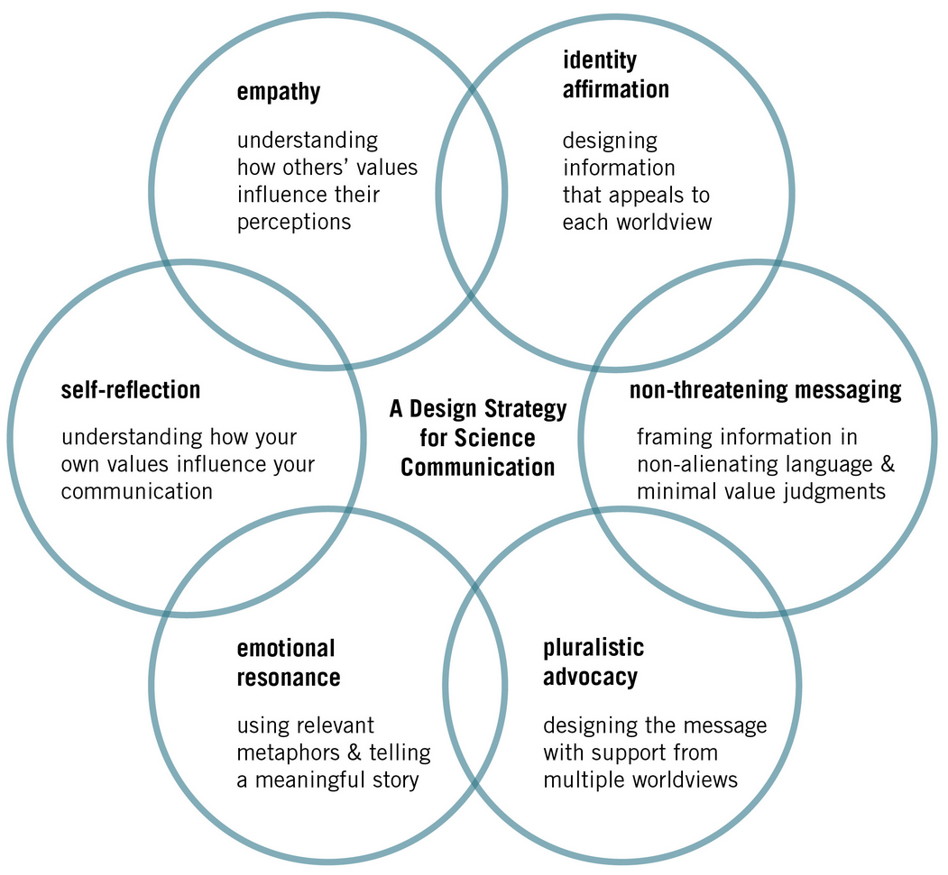 https://crastina.se/wp-content/uploads/2015/05/1CdCWm9xxH5kPh2J7fnPZmA.png
971
1051
Olle Bergman
Olle Bergman2015-05-17 13:51:042020-04-15 16:26:41Jennifer Briselli: “Help scientists approach science communication like designers”
https://crastina.se/wp-content/uploads/2015/05/1CdCWm9xxH5kPh2J7fnPZmA.png
971
1051
Olle Bergman
Olle Bergman2015-05-17 13:51:042020-04-15 16:26:41Jennifer Briselli: “Help scientists approach science communication like designers”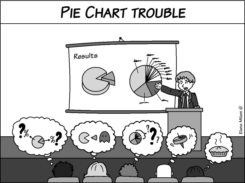 https://crastina.se/wp-content/uploads/2015/05/pie_chart_trouble.jpg
612
820
Elena Milani
Elena Milani2015-05-05 12:06:412016-07-25 23:01:15Designing better graphs, part 1: Pie charts—popular but sometimes unclear
https://crastina.se/wp-content/uploads/2015/05/pie_chart_trouble.jpg
612
820
Elena Milani
Elena Milani2015-05-05 12:06:412016-07-25 23:01:15Designing better graphs, part 1: Pie charts—popular but sometimes unclear https://crastina.se/wp-content/uploads/2015/05/von-Restorff-effect-2.jpg
595
807
Luk Cox
Luk Cox2015-05-05 10:25:282016-08-09 03:07:55The von Restorff effect
https://crastina.se/wp-content/uploads/2015/05/von-Restorff-effect-2.jpg
595
807
Luk Cox
Luk Cox2015-05-05 10:25:282016-08-09 03:07:55The von Restorff effect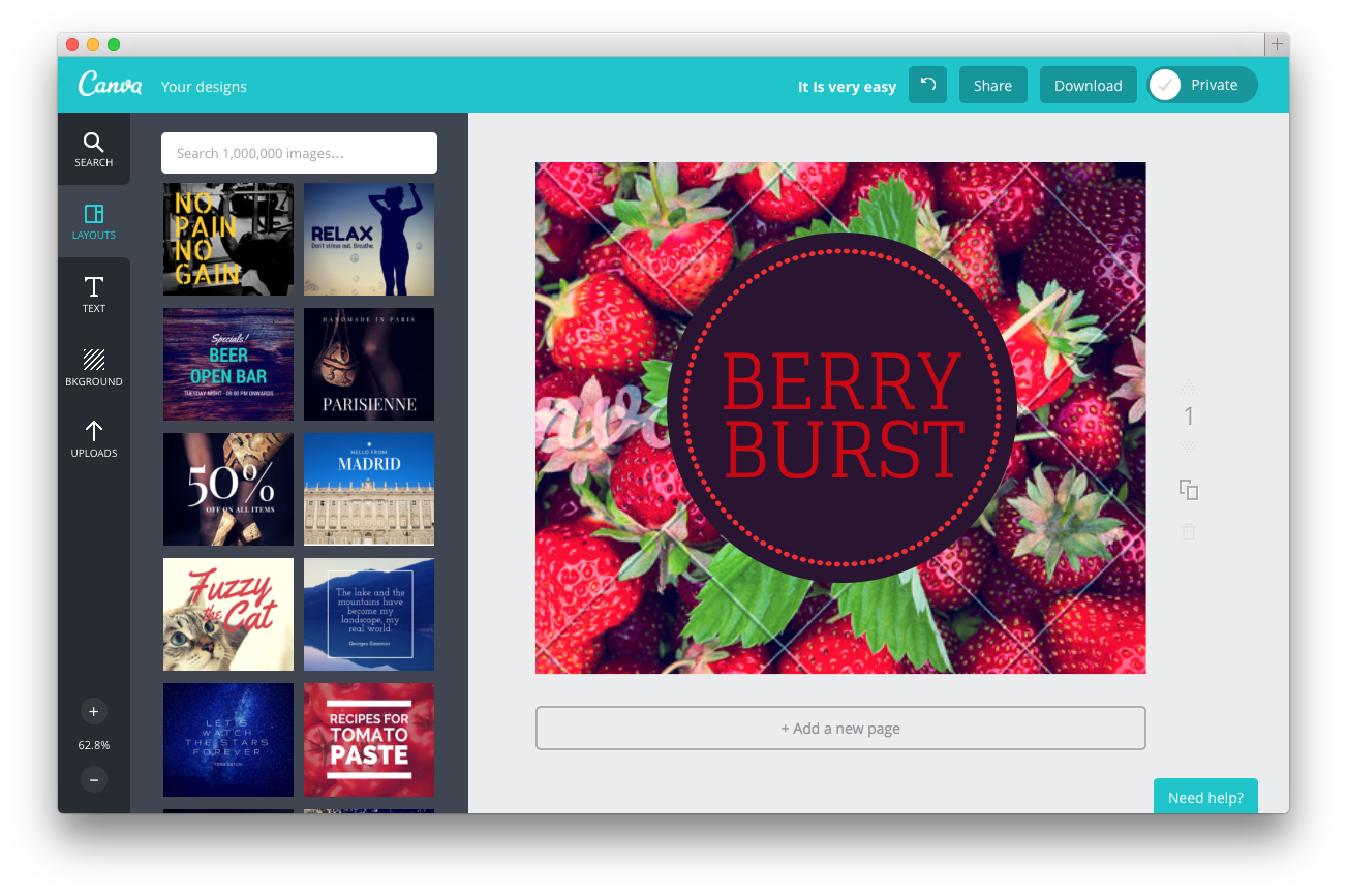 https://crastina.se/wp-content/uploads/2015/03/Skärmavbild-2015-03-16-kl.-10.00.43.png
867
1303
Olle Bergman
Olle Bergman2015-03-16 11:46:092016-07-26 22:19:42Conversation with a Canva Community Outreach Specialist
https://crastina.se/wp-content/uploads/2013/09/typeispower.png
647
852
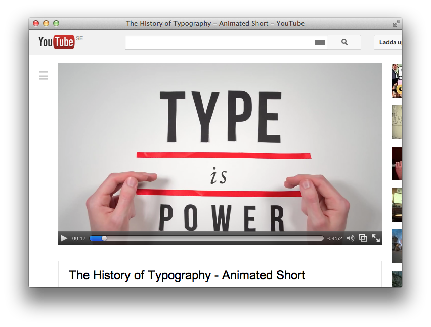
Olle Bergman
Olle Bergman2013-09-16 11:48:402016-07-27 23:01:00”Type is Power!” – great animated summary
https://crastina.se/wp-content/uploads/2015/03/Skärmavbild-2015-03-16-kl.-10.00.43.png
867
1303
Olle Bergman
Olle Bergman2015-03-16 11:46:092016-07-26 22:19:42Conversation with a Canva Community Outreach Specialist
https://crastina.se/wp-content/uploads/2013/09/typeispower.png
647
852
Olle Bergman
Olle Bergman2013-09-16 11:48:402016-07-27 23:01:00”Type is Power!” – great animated summary