Posts
 https://crastina.se/wp-content/uploads/2016/09/Illuscientia_371x301.png
301
371
Pieter Torrez
Pieter Torrez2016-09-05 21:05:502016-09-22 01:33:49How to create clear and attractive graphs/illustrations?
https://crastina.se/wp-content/uploads/2016/09/Illuscientia_371x301.png
301
371
Pieter Torrez
Pieter Torrez2016-09-05 21:05:502016-09-22 01:33:49How to create clear and attractive graphs/illustrations?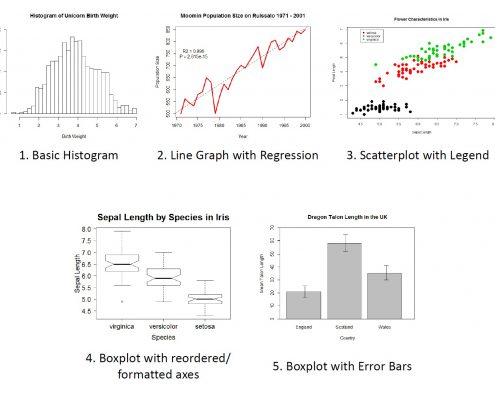 https://crastina.se/wp-content/uploads/2016/08/Rgraphs_susanjohnston.jpg
1228
1648
Susan E. Johnston
Susan E. Johnston2016-08-09 10:58:132016-09-08 23:12:46Base Graphics in R: A Detailed Idiot’s Guide
https://crastina.se/wp-content/uploads/2016/08/Rgraphs_susanjohnston.jpg
1228
1648
Susan E. Johnston
Susan E. Johnston2016-08-09 10:58:132016-09-08 23:12:46Base Graphics in R: A Detailed Idiot’s Guide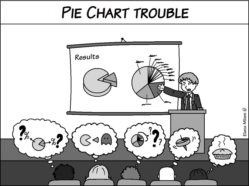 0
0
Elena Milani
Elena Milani2015-09-09 14:36:332016-07-25 23:01:59Designing better graphs, part 2: Bar charts — simple but effective
https://crastina.se/wp-content/uploads/2015/05/pie_chart_trouble.jpg
612
820
Elena Milani
Elena Milani2015-05-05 12:06:412016-07-25 23:01:15Designing better graphs, part 1: Pie charts—popular but sometimes unclear
0
0
Elena Milani
Elena Milani2015-09-09 14:36:332016-07-25 23:01:59Designing better graphs, part 2: Bar charts — simple but effective
https://crastina.se/wp-content/uploads/2015/05/pie_chart_trouble.jpg
612
820
Elena Milani
Elena Milani2015-05-05 12:06:412016-07-25 23:01:15Designing better graphs, part 1: Pie charts—popular but sometimes unclear