Andy Brunning, Compound Interest: “Infographics can grab the attention in ways an article on a topic can’t.”

A chemist by training, Andy Brunning turned to teaching when he realized he wasn’t fond of lab work. As a secondary chemistry teacher having little luck finding eye-catching posters to put up in his classroom, Andy decided to make them himself and share them with other teachers – and so Compound Interest was born.
I had unknowingly used one of Andy’s infographics for university open days, and when I first visited the Compound Interest page, I immediately recognised the work. I was amazed by the immense range of chemistry-related topics covered by Compound Interest and, as a chemist myself, couldn’t help admire the effective and accurate communication of key concepts. I reached out to Andy for an interview, to ask him about the motivation behind the webpage, as well as the secret for such pleasing, informative infographics.
Hi Andy! What is your main goal or ambition with Compound Interest, and why did you choose infographics as the media to achieve that?
The main ambition for Compound Interest has always been to communicate chemistry in an accessible, engaging way, and also in a way that’s distinctive. There are already loads of great science writers writing on chemistry topics out there, but when I first started Compound Interest there wasn’t much in the way of chemistry-related posters or infographics.
‘(…) when I first started Compound Interest there wasn’t much in the way of chemistry-related posters or infographics.’
I was encouraged into the approach by seeing the popularity of other infographics-based work. David McCandless’ work on Information is Beautiful was getting a lot of attention at the time, and I was also encouraged by seeing the work of James Kennedy, who started making chemistry-related posters around the same time I did.
Infographics can grab the attention in ways an article on a topic can’t. They have the advantage of being very visible on social media, so they’re more widely shared and seen. And they’re good for making me focus on the key points around a topic as well – it’s not possible to fit every nuance in, so I have to really think about what the key information is for the Compound Interest audience and how best to convey that in the space available.
Is maintaining a consistent style something you do out of habit or it is a conscious effort to develop a brand? Do you consider this consistency important?
It’s definitely a conscious choice to make the Compound Interest graphics consistent in appearance and recognisable. I’ve tweaked the visual style of them over the years, but that’s as I’ve picked up different things or adapted the designs to make them more aesthetic.
I think it’s important to have that consistency because it’s part of building trust with the people who follow the Compound Interest graphics. Whatever topic a particular graphic is on, and wherever people see it, regular followers will recognise the style, as you did, and have hopefully come to see the graphics as a reliable source of information.
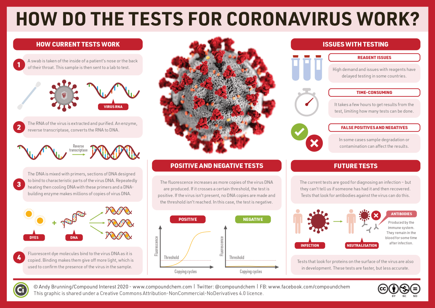
One of Andy’s most recent infographics on the science behind testing for the new coronavirus.
You have an extensive list of infographics by now, and even a book! Do you ever worry you will run out of material? Where do you get your inspiration?
I’m nowhere near running out of ideas for graphics! I don’t think I’m ever likely to run out of topics to look at, because each individual graphic is often so focused, and because there are always new stories. For instance, I’ve made several graphics looking at issues relating to the current coronavirus pandemic, a topic where there’s a lot of demand for simple, well-communicated information.
Inspiration comes from a range of places. It can come from topics that are currently in the news, or things that just pop up in my day-to-day life. I have a one-year-old son, so over the past year there’ve been posts on pregnancy tests, disposable nappies, and more!
Do you get many direct requests for infographics? In which contexts have you known your work to be used?
I share the Compound Interest graphics under a Creative Commons BY-NC-ND license. This means that they can be used freely (for non-commercial purposes) as long as attribution back to the Compound Interest site is given, and as long as no changes are made to them.
I’ve seen plenty of people using the graphics online under these terms, which is great – my desire has always been for the graphics to be widely disseminated and that they might help with public understanding of chemistry topics.
The graphics have been used in a whole range of contexts. I was at a chemistry education conference in South Dakota a few years back, and an agricultural museum there had one of my posters on beer chemistry as part of their exhibits. They’ve also been published in a range of magazines (and not just science-related ones!) and I’ve seen innumerable school displays using them.
Do you have any tips for someone wanting to combine graphic design with science communication?
‘(…) developing your own consistent and recognisable style is something worth considering.’
Firstly, if it’s something you want to do on a regular basis, developing your own consistent and recognisable style is something worth considering. Look online for examples of graphic design you like, and magpie the bits you like best from different sources to create something that’s your own. Even within a recognisable style, there can be lots of room for variety. Eleanor Lutz’s work is a great example of this; her designs are wonderfully adapted to the topics she covers, and yet her work is still very recognisably hers.
I’d also recommend making use of resources available to make design work easier for beginning designers. There are sites like Noun Project, which offers a huge collection of Creative Commons licensed icons, and sites such as Pixabay which offer free-to-use images.
- Turning frustration into change: Jean-Sébastien Caux, founder of SciPost - August 9, 2021
- Dr Nicola Nugent: Publishing Manager at the Royal Society of Chemistry - December 7, 2020
- Public Engagement and Trust in Science: In Conversation with Dr. Farzana Meru - November 23, 2020
- Is the peer review process trustworthy? Perspectives by Dr. Jurado Sánchez - November 4, 2020
- Prof. Maria Baghramian: Policy, Expertise and Trust in Action - October 29, 2020
- Prof. Luke Drury: ‘When Experts Disagree’ - October 5, 2020
- Are we what we hear? A reflection on sound, identity and science communication - September 27, 2020
- Sign your Science - September 22, 2020
- Raven the Science Maven - August 18, 2020
- Dr Mark Temple: DNA Sonification or when Scientist are musicians - August 5, 2020


Really interesting read!
se podrían traducir al spanis?
I have a question rather than a comment and I hope this is ok? I’m researching theobromines’ effects on human beings, and one link suggested checking out Mr. Brunning’s article on Theobromines. Google isn’t helping me find this specific article by Brunning. Would anyone have info on how to find it? Thank you!