Poor infographics adds to the communication noise
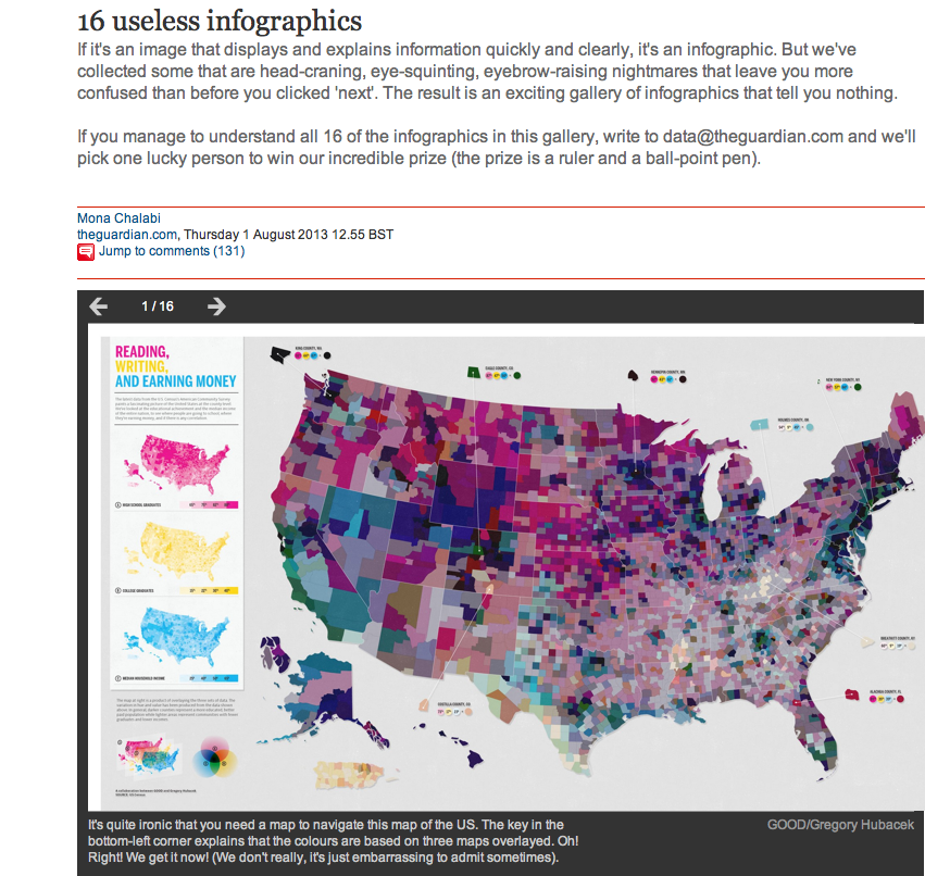
Although I am normally an advocate of telling how to do things, rather than telling how not to do them, I must recommend this slideshow from The Guardian’s Data Blog: 16 useless infographics.
There are so many designers who have misunderstood the point when it comes to infographics. The integration of text, graphics, diagrams, charts and maps should help us study and understand things that were not obvious to us in the isolated channels of information. It’s certainly not an activity aiming to make things fancy, eye-catching … or plain weird.

- Claire Price of Crastina receives outreach award from Royal Society of Biology - October 25, 2020
- Agile Science student project at Brussels Engineering School ECAM: “We can’t wait to try it again!” - August 28, 2020
- Create an infographic in the Lifeology SciArt Infographic Challenge - June 16, 2020
- Adam Ruben – The scientist that teaches undergraduate students comedy - March 27, 2020
- Sam Gregson, Bad Boy of Science: “Comedy helps to bridge the gap” - March 10, 2020
- The Coolest Science Merchandise of 2019 - December 16, 2019
- Science Media Centre (UK) offers guide on dealing with online harassment in academia - November 26, 2019
- Agile project management taught to students and researchers at Karolinska Institutet - September 20, 2019
- Stefan Jansson: Improve your credibility! (Crastina Column, September 2019) - September 6, 2019
- The People’s Poet: Silke Kramprich, tech communicator - August 31, 2019


What is an example of a poor infographic, and how could it be improved to reduce communication noise?
What are some common mistakes that lead to poor infographics, and how can they be avoided to improve communication?