Posts
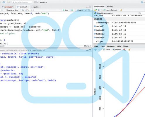
Animations: not so difficult after all
Creating simple animations is not as difficult as you may think. Graphic designer, scientist, and science communicator Szymon Drobniak shares a range of tools and approaches - from graphic software to R - along with tutorials and inspirations…

A short guide to movie making
It's 2016 and visualising your idea through film is easier than ever. Unfortunately, with so many distractions engaging your audience is a lot harder than it was just a few years ago, and making them lend you 10 minutes of their time seems almost…
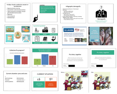
Slide design for dummies
What makes a clear and visually appealing presentation? Toon Verlinden from "The floor is yours" shows an extreme makeover of power point slides, demonstrating a few simple design tricks that work wonders.
This post has been originally…

How to create clear and attractive graphs/illustrations?
Pieter Torrez from Crastina and Scigrades had a quick chat with former scientist-turned-scientific illustrator Agnieszka Kawska who is the main author of the guide "Graphic design for scientists and researchers” . This free guide contains…

Six tips when you’re explaining science to kids
“Explaining science to kids is demanding!” says Michał Krupiński, Polish nuclear physicist and science communicator. Here he shares some of is experience in the form of six tips. The main messages: “Don't be childish, and don't oversimplify!”.
…
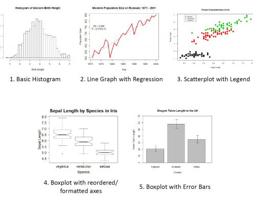
Base Graphics in R: A Detailed Idiot’s Guide
The programming language R is great for data visualization: users have a total control of all graph features, plots can be easily modified or replicated, and the active developers community keeps improving and developing new graphic packages.…
How platforms like Clarafi can drastically improve your scientific visualization skills
Clarafi is a community of scientists, graphics professionals, students and educators interested in scientific visualization. Their scope is everything from advanced uses of visualization in science to visual literacy in the K-12 space.
A…
