Posts
 https://crastina.se/wp-content/uploads/2017/06/fredrik_featured.png
684
845
Olle Bergman
Olle Bergman2017-06-18 17:56:192018-03-06 10:59:19Crastina Column, June–Aug 2017: “Being a proud intermediary” by Fredrik Saarkoppel
https://crastina.se/wp-content/uploads/2017/06/fredrik_featured.png
684
845
Olle Bergman
Olle Bergman2017-06-18 17:56:192018-03-06 10:59:19Crastina Column, June–Aug 2017: “Being a proud intermediary” by Fredrik Saarkoppel https://crastina.se/wp-content/uploads/2016/09/toon_featured.png
684
845
Toon Verlinden
Toon Verlinden2016-09-09 15:15:172017-08-02 11:36:00Slide design for dummies
https://crastina.se/wp-content/uploads/2016/09/toon_featured.png
684
845
Toon Verlinden
Toon Verlinden2016-09-09 15:15:172017-08-02 11:36:00Slide design for dummies https://crastina.se/wp-content/uploads/2015/04/Skärmavbild-2015-05-02-kl.-15.17.31.png
598
1064
Matt Carter
Matt Carter2015-05-01 10:33:312016-07-26 21:58:44What Scientists Can Learn From Designers (Matt Carter, May 2015)
https://crastina.se/wp-content/uploads/2015/04/Skärmavbild-2015-05-02-kl.-15.17.31.png
598
1064
Matt Carter
Matt Carter2015-05-01 10:33:312016-07-26 21:58:44What Scientists Can Learn From Designers (Matt Carter, May 2015)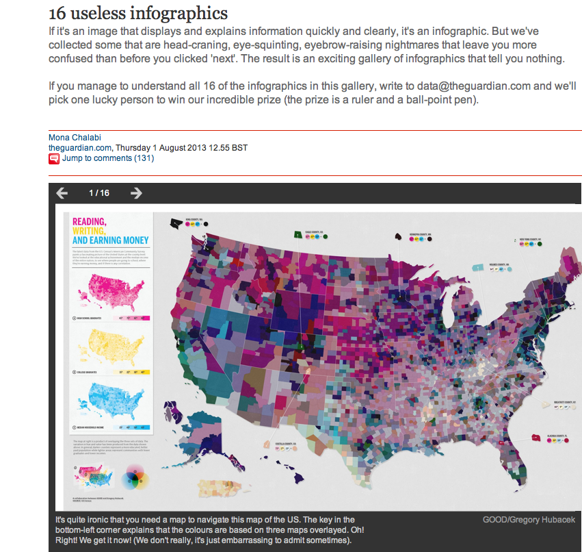 0
0
Olle Bergman
Olle Bergman2015-02-19 10:14:392016-08-01 13:05:42The-best-poster-ever-made interview: James O’Hanlon, Macquarie University
0
0
Olle Bergman
Olle Bergman2015-02-19 10:14:392016-08-01 13:05:42The-best-poster-ever-made interview: James O’Hanlon, Macquarie University https://crastina.se/wp-content/uploads/2015/02/Skärmavbild-2015-02-01-kl.-17.32.46.png
291
517
Olle Bergman
Olle Bergman2015-02-01 01:00:212016-08-09 01:21:37Break the mold with a graphical abstract (Luc Cox, February 2015)
https://crastina.se/wp-content/uploads/2015/02/Skärmavbild-2015-02-01-kl.-17.32.46.png
291
517
Olle Bergman
Olle Bergman2015-02-01 01:00:212016-08-09 01:21:37Break the mold with a graphical abstract (Luc Cox, February 2015) https://crastina.se/wp-content/uploads/2014/11/page.png
361
647
Olle Bergman
Olle Bergman2014-11-13 17:39:002016-07-27 00:13:30Winners announced in third Kantar Information is Beautiful Awards
https://crastina.se/wp-content/uploads/2013/08/useless_featured.png
806
851
Olle Bergman
Olle Bergman2013-08-13 14:10:102016-07-27 23:06:53Poor infographics adds to the communication noise
https://crastina.se/wp-content/uploads/2014/11/page.png
361
647
Olle Bergman
Olle Bergman2014-11-13 17:39:002016-07-27 00:13:30Winners announced in third Kantar Information is Beautiful Awards
https://crastina.se/wp-content/uploads/2013/08/useless_featured.png
806
851
Olle Bergman
Olle Bergman2013-08-13 14:10:102016-07-27 23:06:53Poor infographics adds to the communication noise