Once upon an infographic: using storytelling elements in information design
This Crastina Column by Dr Dorota Paczesniak, an evolutionary biologist and science communicator, initiates the theme ”Visualization & Graphical Abstracts” at the crastina.org website.
One day in 1997, I discovered that my high school library had a shelf of old editions of the American National Geographic Magazine. After that, things were never the same again.
It was in Rzeszów, a medium-size city in eastern Poland. In those days, our search engines were library card catalogues and heavy encyclopedias; the dial-up internet was just like my generation – still in its youth. I hadn’t seen a magazine like this before: filled with captivating photos as well as gripping stories which I read wide-eyed with the help of a large English dictionary. Feeding (and rousing!) my appetite for learning about the natural world, it was simultaneously teaching me English. It has also profoundly shaped my ideas on how to communicate information visually.
Today, when I think about an infographic, what first comes to mind is a double page spread from the National Geographic Magazine, or – even better – the one that folds out into three- or four page width. Excitedly folding out the pages, you’re soon feasting your eyes on a gorgeous artwork. Then you start examining the details. Apart from artwork, there may be a map, a chart, an illustrated timeline. By reading accompanying text (arranged unobtrusively, in small blocks) a new layer of meaning adds to your understanding of the presented scientific concept, technology, history, or environmental phenomenon. It’s a tour de force by a team of gifted and experienced artists, writers and editors, working together in order to integrate their different modes of expression and areas of expertise.
The potential of graphics to communicate science lies beyond their ability to condense and simplify large amounts of information. Their real power is storytelling.
Creative visualizations are an immensely important tool for explaining science, both among science peers and students, and to wide audiences of all ages. But the potential of graphics to communicate science lies beyond their ability to condense and simplify large amounts of information. Their real power is storytelling. The essence of a story is the plot, in other words the sequential presentation of information. Every story has a beginning, a middle and an end. When visualizations employ sequential elements (e.g. timelines, flow charts, before- and after pictures), they start turning into visual narratives.
Stories present information sequentially
As an example, let’s take a pioneering information graphic by Charles Joseph Minard, published in 1861 (Figure 1). It tells the tragic story of Napoleon’s army marching through Russia by displaying several different types of data: the number of Napoleon’s troops during the advance (beige) and retreat (black), the distance travelled, latitude and longitude, direction of travel, location relative to specific dates, and temperatures during the retreat. The sequence is portrayed through the army’s size through time and space, and the two major segments of the military operation (advance and retreat) are additionally highlighted using colour. This infographic is widely acclaimed as one of the best statistical graphics ever drawn.
However, if it was to appear in a present-day National Geographic Magazine, the editorial team would probably add something that is now missing: a portrait of the protagonists. Most likely, there would be artwork showing Napoleon’s troops, starving and exhausted, marching through heavy snow, leaving their tragically lost and frozen companions behind. It’s the characters that bring visual narratives to life and turn them into true storytelling.

Figure 1. Charles Minard (1781-1870). Figurative Map of the successive losses in men of the French Army in the Russian campaign 1812–1813 / Public domain
Characters bring stories to life
Characters are the heart and soul of a story. Including characters into narratives makes them relatable, which enables authors to connect with various audiences, by appealing to their emotional understanding of the world. Finding the characters for visualizations of scientific information shouldn’t be too complicated: there are the scientists who conducted the experiments, the study subjects, the people whom the new knowledge will benefit. There is a scope to create heroes and villains even from inanimate objects, for example vaccines and viruses.
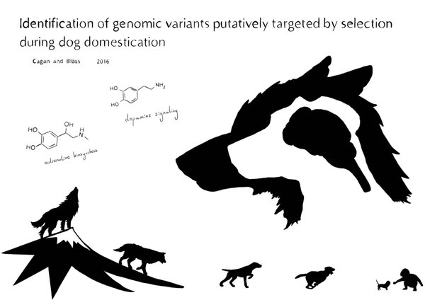
Alex Cagan, one of my favourite contemporary scientific illustrators, skillfully employs the two storytelling elements – plot and character – in a visual abstract shown below (Figure 2). It is a graphic summary of a scientific article meant to convey the findings in a brief format. The research aimed to identify specific genomic regions associated with domestication of dogs. The story goes that the wolf came down from a mountain, changing into a dog more and more with every step, to finally turn into a puppy that a little child can play with. There is also a before/after image sequence with overlaid wolf and dog profiles and a common brain, that signals that this organ was important for the transition. The molecules pictured alongside it are examples of specific genes involved in the fight-or-flight response which have been affected during the domestication process.

Figure 2. Alex Cagan (Postdoctoral Fellow at Wellcome Sanger Institute). Visual abstract: Identification of genomic variants putatively targeted by selection during dog domestication. 2016. Copyright by the Author
Visual storytelling has the power to make complex information more accessible and more relevant. Data alone doesn’t necessarily convince people, but stories have the capacity to do so. Knowledge can be disseminated successfully through visual narratives: pictures condense large amounts of information, and narrative elements can make a connection to our emotions and cultural values. This makes visual narratives a real powerhouse for conveying scientific messages.
Visual communication in the time of coronavirus
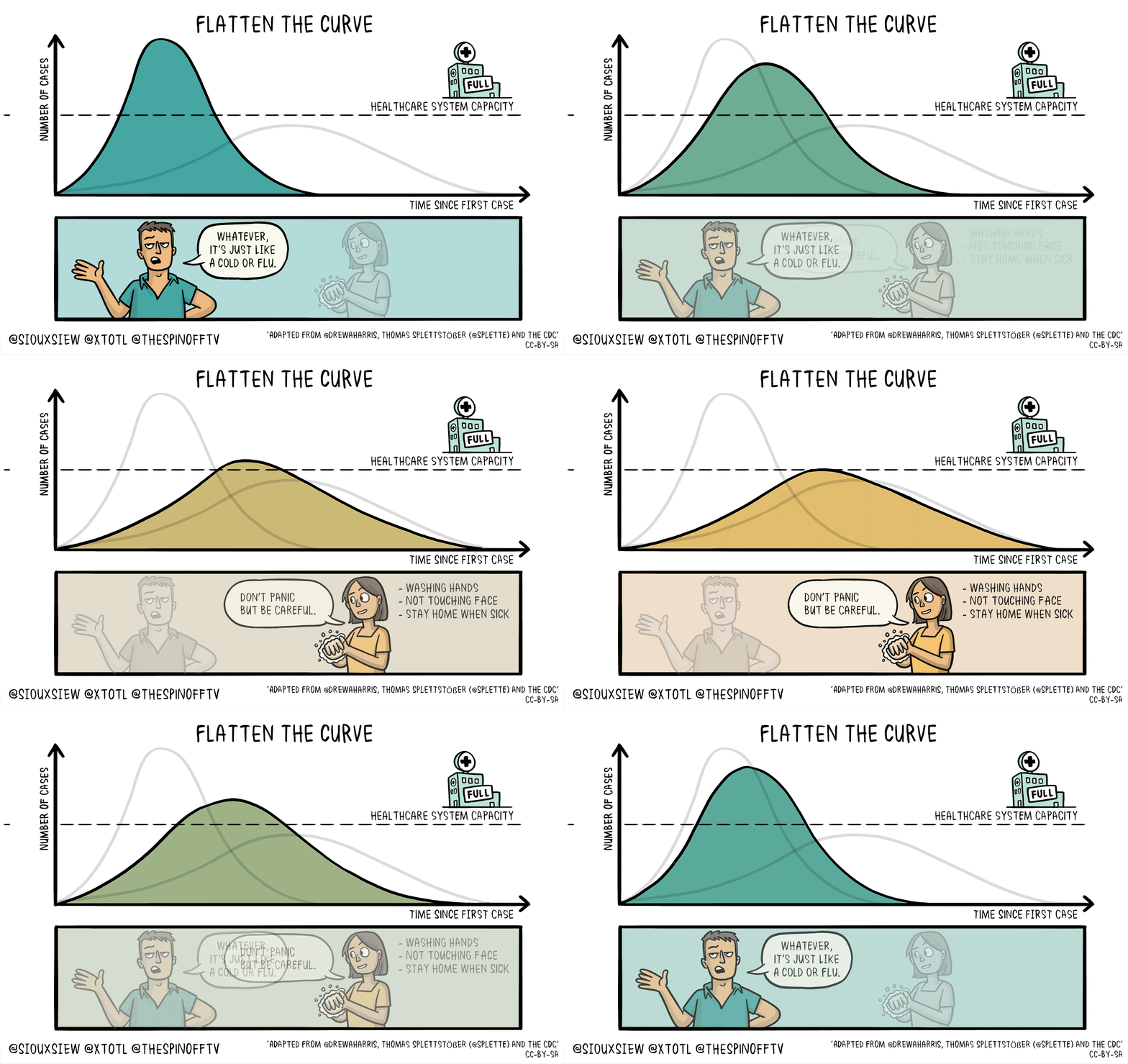
A current example is the illustration of two epidemic scenarios of the current COVID-19 pandemic – the steep and flat curves (Figure 3) – which was widely disseminated during the early days of the crisis. It communicates the expected outcome behind the measures of physical distancing we’re practicing right now in order to prevent new infections and save lives. The complex models of epidemic progression have been boiled down to a simple message: “flatten the curve”, which without a visual explanation would have been obscure and enigmatic.

Figure 3. Siouxsie Wiles and Toby Morris. 2020. Animation explaining the impact of social distancing. Wikimedia Commons
Amidst a viral pandemic it has never been clearer that science is the only way to understand the world, and to predict and counteract threats. But in order to lead people towards common goals (and perhaps eventually to a reality where we can all “live happily ever after”) we need to use our best tools to teach science well, so it is understood widely.
Thank you to Alex Cagan for sharing his illustration, and to Olle Bergman for editorial assistance and introducing me to the early history of infographics.
”Visualizations & Graphical Abstracts”
– the Crastina theme, late spring 2020.
Current articles


Leave a Reply
Want to join the discussion?Feel free to contribute!