Dr Marek Skupinski – visual artist and scientific illustrator
With a PhD in physics, trained in materials science and nanotechnology, Marek Skupinski is an author of scientific illustrations, book covers and editorial illustrations for newspapers and magazines. In addition, he is a founder of Hyperfine Studios which specialize in visualizations of scientific concepts through images and animations.
Crastina got in touch for a short interview
Hi Marek! What led you to the field of scientific illustration?
I have been working as a professional freelancing illustrator for more than 10 years now. My career as an illustrator has evolved from being initially only a side hustle – in addition to my full-time employment – to being my full-time job now.
Scientific illustration has always been important to me, since it allows me to combine my two passions: science and visual arts, especially illustration and animation. Recently I’ve been focusing more and more on scientific illustrations and animations. By creating clear, impactful, and high-quality visualizations I would like to help scientists, start-ups, and companies to communicate research and spread their ideas to broad audiences. Communication of research outcomes, original ideas, or new technologies and devices ought to be presented to a broader audience, beyond just the academic world or technical geeks. The general public also deserves to be well informed. Apart from the educational value, it is a way for the public to follow what is happening with the tax they paid. It’s a win-win situation!
How can visualizations effectively convey scientific messages?
Image and video are the most effective ways of conveying a message. By using images in combination with text you can convey much more information in a shorter time. A visually-appealing image can grab the attention of your audience much easier, making them more willing to read your article or press release, or to finance your grant application. A good looking image is more “shareable” and “likable” across all social media platforms. By a good looking image I mean an image which tells an interesting story. Every little detail in an image contributes to the storytelling, whether it is color, texture, or light. For example, the general color tone tells the audience whether it is a sad story about the risk for cancer or a happy story about prehistoric dinosaurs. Colour can also establish the visual hierarchy in an image, by making some elements stand out and grab the viewer’s attention.
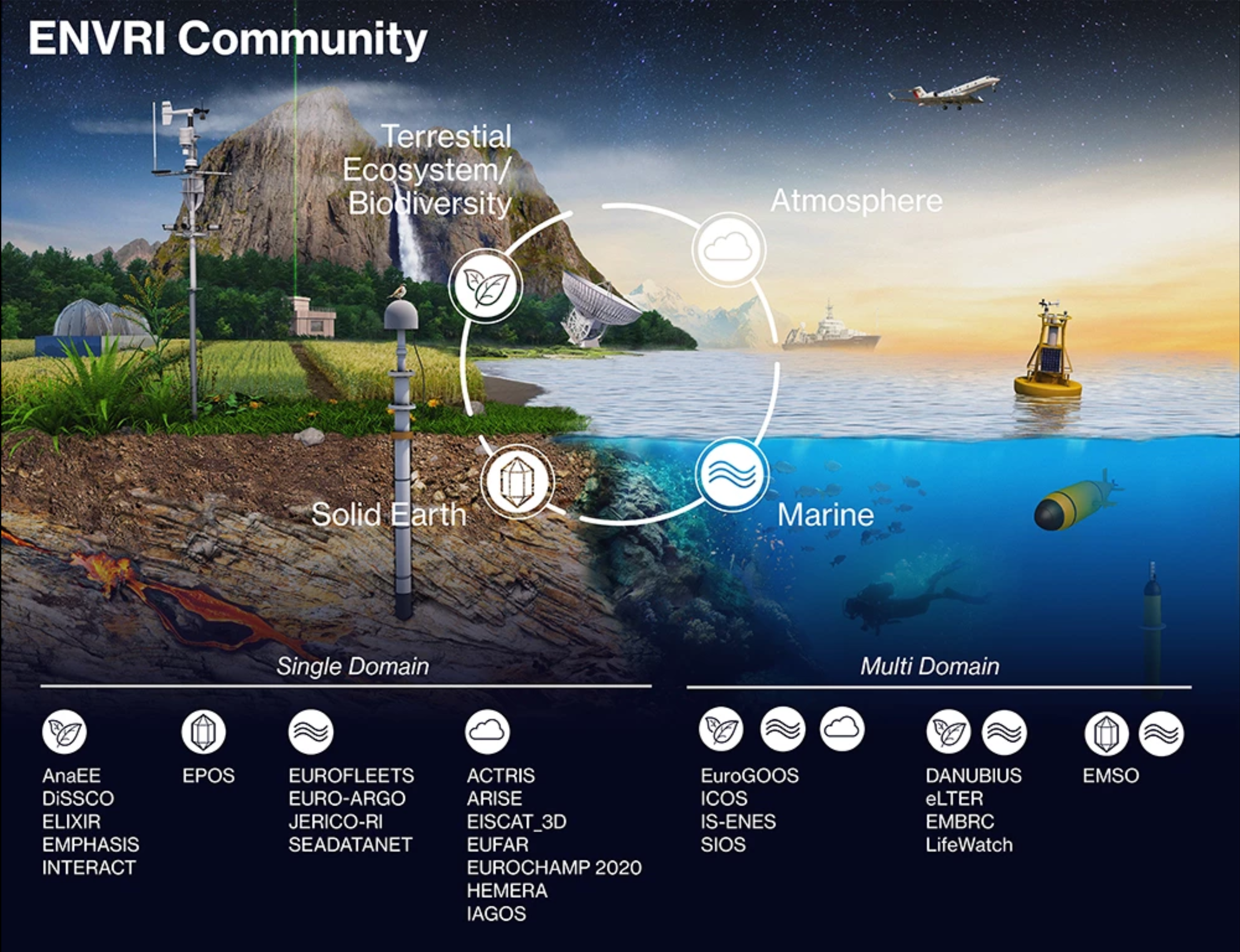
ENVRI Community. Infographic by Marek Skupinski
What are your clients looking for when they seek your expertise as a scientific illustrator, and what do you advise them?
For me, making a scientific illustration or visualization is a collaborative process.
What are your three pieces of advice for scientists who want to communicate science through illustrations and visualizations?
- Be clear on what you want to communicate. The concept of “less is more” works in your favor and helps you to be more clear in conveying your message. If you have many ideas that you want to communicate in one image, make a visual hierarchy of what is most important and what is less (studying some graphic design principles can help here). In my process of making an image, the most important step is to agree on the main message with the scientist – what is the most important thing about the research result and why. Knowing this will guide you through the rest of the design process.
- If you’re working on your own illustration, ask your colleagues or friends what kind of message they perceive when they see it. Is it the same message that you intended to convey? Working on an image forces you to put your thoughts in order. It is much more difficult to be ambiguous than with text. In the process, you may find some gaps in your results, which you have to fill with more information. Working on images with your colleagues helps you to share different perspectives or different aspects of your research.
- It is never a bad idea to contact a professional artist!
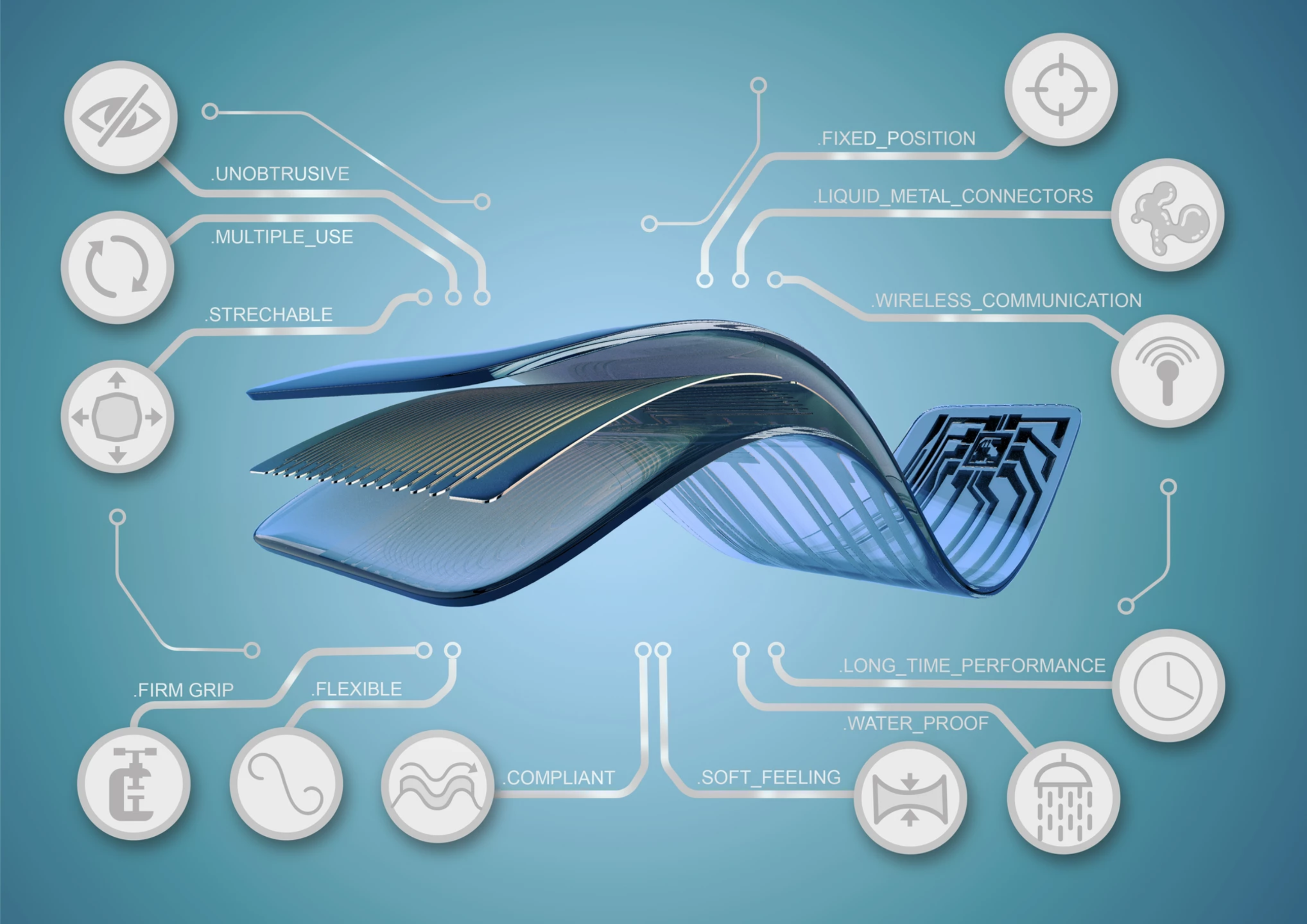
Smart Patch. Infographic by Marek Skupinski
- A handful of podcast recommendations from the Crastina crew - September 12, 2020
- A handful of podcast recommendations from the Crastina crew - August 8, 2020
- Dr Marek Skupinski – visual artist and scientific illustrator - May 6, 2020
- Let’s have a productive conversation about GMO – but first, stop saying “GMO”! - September 23, 2019
- The song of plankton – “visualizing” big data as music - April 9, 2018
- Darwin Day celebrated to promote public understanding of evolution - February 12, 2018
- Crastina Column, Sep–Oct 2017: Can a simple card game help us see things from ”the other’s” point of view? - September 19, 2017
- Talking science from the top of a soap box - February 13, 2017
- Science Gingerbread competition - December 13, 2016
- Dance your PhD – 2016 edition open for registration - September 14, 2016


Leave a Reply
Want to join the discussion?Feel free to contribute!