Posts
Toolbox from Karolinska Institutet inspires bioentrepreneurs to create and collaborate
You don’t have to be a genius to spark ideas, turn concepts on their heads or inspire groups to work in the same direction – you just need tools! A collection of such tools was newly published in English by the Unit for Bioentrepreneurship,…

Designing better graphs, part 2: Bar charts — simple but effective
In science, engineering and health communication data are often displayed through charts. The choice of the graphic form is far from rigid. For example, to show a percentage one can use both a pie chart and a bar chart. The choice depends on…
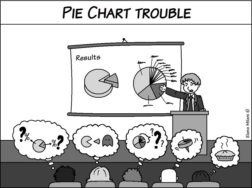
Designing better graphs, part 1: Pie charts—popular but sometimes unclear
This is the first of a three part tutorial where Elena Milani (@biomug on Twitter), a science communicator with a neurobiology background, gives some advice on how to use graphs in a more effective way.
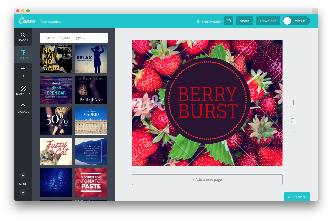
Conversation with a Canva Community Outreach Specialist
Canva – a web tool for creating graphics – has a very interesting social media strategy, where they put special Community Outreach Specialists to work.

5 TIPS #2: How to succeed as a fact-seeking interviewer
How do you get to hear really interesting stuff when you’re gathering facts, experience and opinion during an interview for an article, report, etc? By establishing trust between you and the interviewee!
New biweekly pdf article format: 5 TIPS
Starting tomorrow, I will publish a biweekly article with communication tips at LinkedIn. Being very eager to get started, I have decided to create a preview edition for the Crastina readers.

Andreas Møgelhøj, The Geek That Speaks: ”My dream is to create a tech talk revolution”
Andreas Møgelhøj, Danish chemist and physicist, presents some really inspiring videos on the art of tech talks exploring themes like ”The Curse of Knowledge” and the ”Big Picture Secret”.
