Designing better graphs, part 2: Bar charts — simple but effective
In science, engineering and health communication data are often displayed through charts. The choice of the graphic form is far from rigid. For example, to show a percentage one can use both a pie chart and a bar chart. The choice depends on the results one wants to achieve, and on the degree of numeracy and graphical literacy of the audience. This means that the form must be functional to the message one wants to convey. This is the second of a three part tutorial where Elena Milani (@biomug on Twitter), a science communicator with a neurobiology background, gives some advice on how to use graphs in a more effective way.
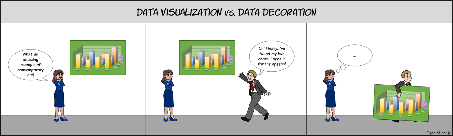 Bars charts depict discrete quantities over a period, and they are the most effective way to display the difference between two or more sets of data, because the viewer can easily compare the length of the bars. Instead, bar charts are not suited at all for displaying continuous data nor the percentages of a whole (in the last case, a pie chart would be better). However, bar charts may be misunderstood if they are plenty of decorative useless details, such as shades and 3D shape, or if they lack of important information such as axis title, labels, etc.
To design a bar chart that displays data effectively, we must follow some simple rules:
- Give the key message in the chart title.
The title must convey the message of the data, and it must lead the viewer to the main point of the chart. For example, the title “Individual variability in drug response” does not give any idea about the chart key point, even if it is quite specific. Therefore, this title can be reformulated as “Gender may be a risk factor for adverse drug reactions” or can be followed by the subtitle “Treated male patients had a higher incidence of side effects than females”, which tells the main message of the chart; - Always include all the metadata.
To be clear and understandable a bar chart must contain metadata such as title axis, labels or legends, measurement units, source of data, sample size, and the period of time of data collection, because all these information help the reader to contextualize the data. There are some exceptions: legend can be omitted when categories are identified by labels, whereas the sample size is needed only data are displayed in percentage or proportion; - Avoid vertical or diagonal labels in the x axis.
Horizontal labels are the most readable, however when they are too long they can reduce the clarity of the chart. In this case, you should use a horizontal bar chart, instead of a vertical one, or you can abbreviate the description (e.g.; July 2010 can be written as 07/10) or group item labels (e.g.; instead of listing each year 2010, 2011… 2015, you can insert only 2010 and 2015 labels);
Use a horizontal bar chart or abbreviate the descriptions when labels are too long.
- Avoid to plot bars in a random order.
Rank the bars in chronological order, alphabetic order, or from the smallest to the largest one. The order of the bars must facilitate the reading; - Begin your bar chart at zero baseline.
In a bar chart that does not begin at zero baseline the bars are truncated and do not show their total values, thus the comparison between the data sets results difficult and misleading; - Avoid useless decorative details.
Useless information, such as rainbow colours bars belonging to the same category, shadows, coloured background grids, etc., confuse the viewer; - Avoid 3D bar charts.
2D bar charts are clearer than 3D ones. Indeed, 3D bars are misunderstanding because it is not clear where their top meets the grid, thus they tend to be flat out wrong by the viewer;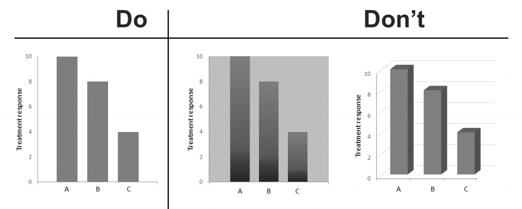
Avoid decorative details and 3D rendering to make a bar chart readable.
- Choose bars colours carefully.
When all the bars of your chart belong to the same group, move the shading of the bars from the lightest to the darkest for easy comparison. Instead, when the bars belong to different categories you can group them through colours. You must choose colours basing on their cultural meaning, otherwise they will confuse the viewer. For example, bars related to positive incomes should be coloured in green, because this hue is associated to money earning by Western people (but not by Chinese). You can use colours also to highlight a specific bar in the chart, thus catching the viewer attention on that specific set of data.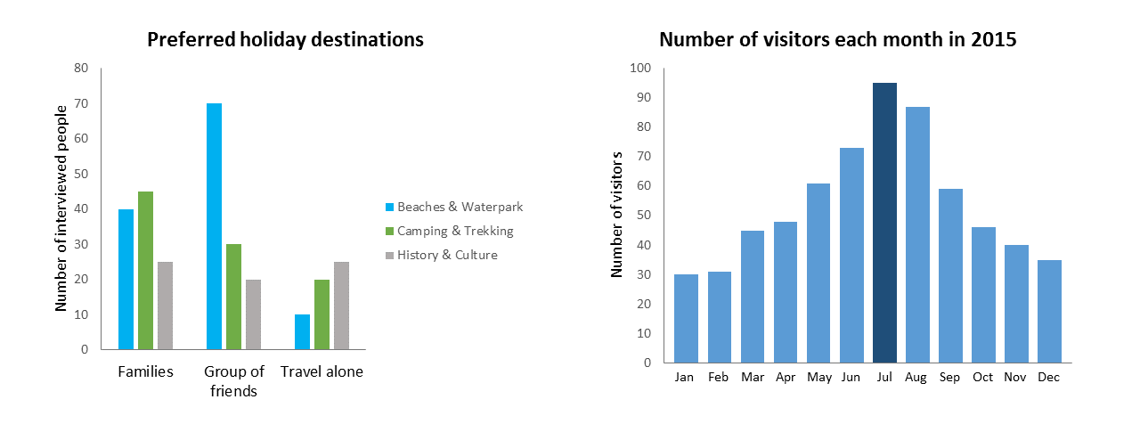
Examples of how to choose colours to group categories (on the left) and to highlight a set of data (on the right).


Elena Milani, @biomug
Elena Milani has a Master’s degree in Neuroscience (University of Trieste) as well as a Master’s degree in Science Communication and an academic certificate in Data Analysis and Presentation (University of Padova). Among many other things, Elena is an illustrator, a digital media communicator at scientific conferences and a blogger – see SciComm Lab and her Portfolio blog.


Leave a Reply
Want to join the discussion?Feel free to contribute!