Base Graphics in R: A Detailed Idiot’s Guide
The programming language R is great for data visualization: users have a total control of all graph features, plots can be easily modified or replicated, and the active developers community keeps improving and developing new graphic packages. R may seem intimidating if you never used it, but with this beginners guide by Dr. Susan E. Johnston you can start exploring its powerful plotting possibilities.
This post has been originally published on Susan’s blog.
One of the most powerful functions of R is its ability to produce a wide range of graphics to quickly and easily visualise data. Plots can be replicated, modified and even publishable with just a handful of commands.
Making the leap from chiefly graphical programmes, such as Excel and Sigmaplot may seem tricky. However, with a basic knowledge of R, just investing a few hours could completely revolutionise your data visualisation and workflow. Trust me – it’s worth it.
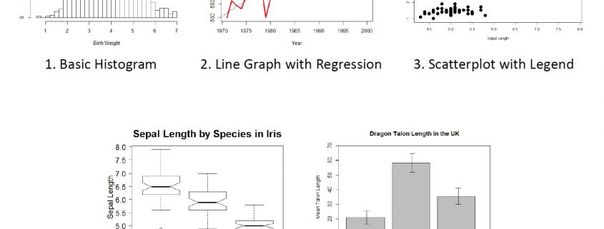
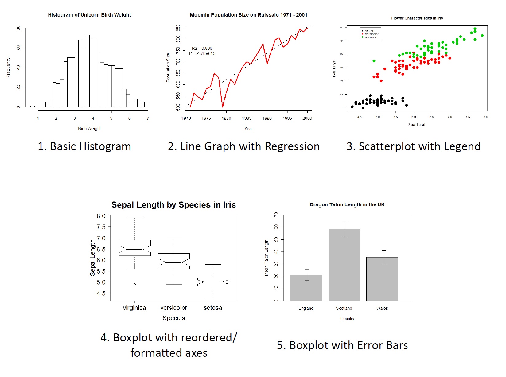
Last year, I presented an informal seminar on the basics of R Graphics at University of Turku. In this blog post, I am providing some of the slides and the full code from that practical, which shows how to build different plot types using the basic (i.e. pre-installed) graphics in R, including:
After much wrangling with WordPress, I used the very simple ‘Publish’ button on R-Markdown to host the tutorial on RPubs. This post is BIG, but DETAILED. The Tutorial itself is HERE and all code and datafiles are available here.
Feedback is welcomed. I hope someone out there finds it useful!
An Introduction to R Graphics: Slides
- Base Graphics in R: A Detailed Idiot’s Guide - August 9, 2016


Leave a Reply
Want to join the discussion?Feel free to contribute!