#BetterPoster: The New Minimalism Act
During the early summer, the concept #BetterPoster made quite a stir on social media of the scientific community. Mike Morrison, Ph.D. student from Michigan got tired of the old “wall-of-text” poster design and introduced a radical new format which he claimed to be a “new, faster approach to designing research posters”. In this interview, he dives a bit deeper into the concept.
Text by Ushashi Basu. Interview questions by Ushashi Basu & Ellinor Nilsson.
For Mike Morrison, a doctoral student of Industrial-Organisational Psychology at Michigan State University, poster sessions are frustrating, tedious and sometimes even wasteful. In a conference teeming with hundreds of posters arranged in neat rows, attendees are directionless. They easily become unsure of which posters to read, who to talk to and most importantly, how much information to retain. Unimpressed by this general feeling of disinterest and the rejection of his poster by people skimming through the poster boards, Mike decided to take things in his own hands and turn the situation around.
“Science is hard to do, but it doesn’t have to be hard to understand.” – Mike Morrison, PhD student, MSU
Mike experienced not only one, but two Eureka moments: “First, I was as frustrated as anybody else with poster sessions. Second, something very motivating happened to me. I had a big health issue. I was afraid science wasn’t advanced enough to heal me. I got it in my head that improving the communication efficiency of posters — ALL posters — could actually accelerate the pace of science and, well, fix me sooner,” he says.
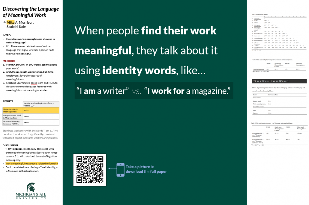
Mike called the concept he came up with #BetterPoster. At first glance, the layout of #BetterPoster seems contradictory to the idea of a conventional research poster. It’s surprisingly empty, and the emptier you make it, the better it gets. “Less equals more!” he says. “The less content you put on it, the more people will engage with it. When you’re so concise it makes you uncomfortable, you’ve created an engaging poster. It seems opposite of what you think, but it works! Being more concise and leaving more empty space makes your poster less scary and more approachable.”
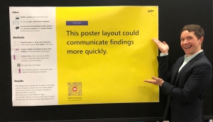
Mike with his #BetterPoster
So how do we start implementing the #BetterPoster? “Think of the poster presentation as an opportunity to teach people ONE thing you learned,” he says. ”One. Design your poster first to really help people understand and remember that ONE thing, and then worry about getting them to remember the other million things you did second. If you can do that, you’re going to out-perform 99% of other posters.” Part of Mike’s formula is that if a particular design is too overloading, the first step would be to “wipe the poster clean and add things back a piece at a time, to see what’s actually needed and what’s fluff.”
In the greater scheme of things, this makes sense. The idea is to avoid cramming every information one has gathered over years of research into one A0 sized sheet and since there is no limitation in terms of conformity, creativity is the way to go. “There are no rules; just fears. For some great inspiration, don’t look at what other scientists are doing. Look at what designers are doing,” says Mike, who – on his first #BetterPoster layout – made the title “huge and bold”, almost hilariously huge and this, in turn, he mentions, attracted more people than usual.
Assessing the audience beforehand is also an important aspect. “You have 3 audiences: 50-100 people walking by in ten seconds, 5 people who will stop and talk and 3 who will read silently. Your biggest audience is the 50-100 people who walk by. So, try to teach them something,” says Mike. At the end of the day, what we should really take out of a poster session is how many people the research topic influenced and if it truly had the outreach it deserved.

In a world where living- and work-spaces are overruled by minimalism, perhaps the #BetterPoster is taking us closer to scientific minimalism
This new revolution in the scientific poster is particularly important and worthwhile because it highlights what really matters in research and how we propagate the most important parts of research to the rest of the world, while also rendering science with much needed comic relief. And apart from presenting a single, central idea, Mike believes that through the #BetterPoster, one would spend more time answering thoughtful questions and talking about new ideas which would benefit the scientific community in the long run. In Mike’s opinion, if we all learned to explain our studies like we would if we were out with friends for drinks, we’d double public engagement with science. He also mentions that although science is hard to do, it doesn’t have to be hard to understand.
Several conferences around the globe have already seen the appearance of the new poster layout and we can only hope that the frequency of attractive and interactive posters increases. “We’re all smart people doing cool stuff, so let’s get extra nerd-silly about it and stop taking ourselves so seriously!” says Mike. He’s already on his way to preparing a video about fun and better presentations, to be released next year.
Download the #BetterPoster template here.
Watch his first video here.
- The Art of Scientific Performance: Science Busking with David Price - March 4, 2020
- Denialism Attitudes and How to Approach Them – an interview with Christopher Swingle - September 12, 2019
- #BetterPoster: The New Minimalism Act - June 29, 2019
- Writing Poetry for Engineers – Behind the Scenes - May 23, 2019
- Conversations about Conservation: Simon Watt and The Ugly Animal Preservation Society - December 22, 2018
- India STEM Foundation – The First of Its Kind, connecting young minds around the world - October 25, 2018


Leave a Reply
Want to join the discussion?Feel free to contribute!