Designing better graphs, part 1: Pie charts—popular but sometimes unclear
In science, engineering and health communication data are often displayed through charts. The choice of the graphic form is far from rigid. For example, to show a percentage one can use both a pie chart and a bar chart. The choice depends on the results one wants to achieve, and on the degree of numeracy and graphical literacy of the audience. This means that the form must be functional to the message one wants to convey. This is the first of a three part tutorial where Elena Milani (@biomug on Twitter), a science communicator with a neurobiology background, gives some advice on how to use graphs in a more effective way.
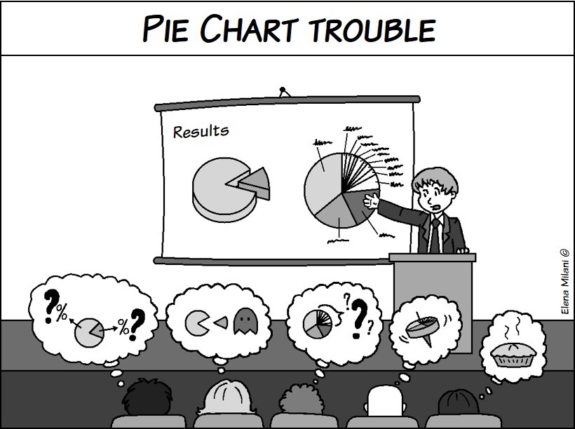
 It’s hard to say why pie charts are so popular, and why people tend to prefer them to bar charts. However, popularity doesn’t always mean clarity: 3D shape, redundancy or, at the contrary, the lack of information, can lead to misinterpretation of the chart. Their main use is to show the proportions that make up a whole. They aren’t suitable to compare different sets of data.
Yet some simple tips can help to draw a clear and readable pie chart:
- Start 12 o’clock and go clockwise.
Start with the largest segment on the top of the pie chart to emphasize its importance, and order the remaining segments clockwise; - Never make a pie chart with two slices.
A pie chart with only two slices will look like Pac-Man, thus it’s better to write the two percentages in numbers; - Use no more than five or six slices.
Otherwise, the visual distinction among the different slices becomes meaningless. If you have many segments, you can put together all the smaller and less significant ones to make the fifth (or sixth) slice, and label it “Other”. However, if you cannot, consider to use another kind of visualization, such as bar charts; - Indicate the sample size.
On how many elements have you calculated your percentages? Indeed, the same percentage, for example 80%, could refer to a sample of 1,000 elements or of 10; - Avoid legends.
Instead, use labels placed near the respectively slices. You can also place the labels inside each segment but only in black and white charts, because colour reduces legibility; - Use visual emphasis sparingly.
Highlight only the most important slice and use only one effect to do it, such as explosion or colour; - Avoid redundant and decorative details.
The same goes with too many different shades and colours, because they can be confusing. However, if you need to apply many colours or shades, choose them by the same hue palette; - Avoid 3D pie charts.
They divert audience’s attention from the displayed data, and enhance misrepresentation of each segment’s proportion to the whole.
Elena Milani, @biomug
Elena Milani has a Master’s degree in Neuroscience (University of Trieste) as well as an academic certificate in Data Analysis and Presentation (University of Padova). Among many other things, Elena is an illustrator, a digital media communicator at scientific conferences and a blogger – see SciComm Lab and Memotak.


Trackbacks & Pingbacks
[…] an idea! I think I’ll start a survey on #AcademicsWithBeer ? Don’t forget to read Elena’s piece about pie charts here on Crastina! var hupso_services_t=new Array("Twitter","Facebook","Google […]
Leave a Reply
Want to join the discussion?Feel free to contribute!