Interview with Lucy Poley – Tips to make great graphical abstracts

Lucy Poley is a scientist and artist with interests in ecology, geography, and wildlife biology. She is interested in communicating scientific principals and inspiring others through visual art. Here we speak to her about about her journey merging science and art and her tips for creating a great graphical abstract.

Hello Lucy! Could you give an overview of your journey merging science and art?
As long as I can remember I have loved art, nature, and science. I spent much of my childhood in my neighbour’s treehouse drawing page after page of animals, plants, and dinosaurs and the rest of my childhood climbing trees, examining flora and fauna, and conducting “experiments”. As I reached university age I figured I had to choose between art and science and ultimately chose to study biology at university with the rationale that it’s easier to do art on the side of a science degree than the other way around. Later on in grad school, I began to realize I didn’t really have to choose between the two, and that art and graphic design have a huge role to play in displaying and communicating scientific information. I started to explore how to do that and created my first graphical abstract for a research paper on wolverines I co-authored. This abstract got a very positive reception and really drove home to me the fact that I could combine the two things I enjoy the most. Good graphic and artistic design is extremely helpful for conveying science, especially to non-experts. Now I have created several more graphical abstracts for my own and other research papers and hope to continue merging these two interest areas in my career.
On your website, www.lucypoley.ca, you have an excellent piece on graphical abstracts. Why do you think graphical abstracts are so important?
Graphical abstracts, and more generally scientific graphics, play a very important role in communicating scientific concepts. Scientists want to share the results of their research with others and ultimately have the research be useful in some way, but when your audience consists of people from different backgrounds, with different levels of experience, and with different interests, it can be challenging to adequately summarize research in a way that conveys messages to everyone. Graphical abstracts can help with this – they are eye-catching, straightforward, and can be tailored depending on who your audience is. Graphical abstracts can be shared online via social media or websites, printed out in person, and sometimes even accompany publications in scientific journals, so they can be used to reach a wide range of people.
While they generally get good reception from other scientists and researchers, what I’ve really found is that graphical abstracts accompanying scientific papers help people who may not have a background in that field to understand the concepts and results being conveyed. People are much more likely to look at and read a graphical abstract than a full scientific paper, so it’s a great way to get across the general idea of research without overwhelming readers with details and jargon. Graphical abstracts also seem to appeal to people of all ages, including younger readers who may not be ready to read a scientific paper but are interested in the research nonetheless. And as the saying goes, a picture is worth a thousand words – some scientific concepts or discoveries can be very challenging to understand without illustrations. Graphical abstracts can help make these concepts easier to grasp for everyone.
When you are designing a graphical abstract, what do you consider important points to feature?
In general I think that graphical abstracts should be fairly simple and only feature the key points of the research they are highlighting. Combining two or three important points with eye-catching graphics can help to get the main message of a scientific study across without delving too deeply into the details. The graphical abstract should summarize and highlight the most important findings and results of a scientific paper alongside interesting and relevant graphics. Keeping text short and free of jargon is important, and including catchy graphics draws the reader in and keeps them interested.
I also think it’s valuable to include at least one figure (i.e. a graph, a map) from the paper that represents an important finding, but modified and simplified to match the style and design of the overall abstract. I’ve seen lots of graphical abstracts that simply take a figure out of the paper and put a different title on it, which I think is missing the point. A good graphical abstract summarizes the key points of the research and should use figures to back up these key points but shouldn’t just be a figure straight out of a paper. It’s not just about reproducing one of the figures from the paper – it’s more about visualizing the publication’s abstract in a way that concisely “tells the story” of the research project.
Do you have any advice for anyone trying to create/produce a graphical abstract?
Here are some tips from my article on my website:
1) Be concise! This is maybe the most difficult part of graphical abstract creation, in my experience – distilling the essentials of your research down to a point where they can be represented in a single figure. In my abstracts, my goal is to make the font large enough that the text can be read on a phone. This means I’m fairly limited in how much I can write, but it’s really hard to determine what the most important points are (especially when it’s your own research). I usually first create the layout of the abstract so I know how much space I have to write, then write out the copy and edit it down until it fits that space in a readable font size. If you have a hard time trimming your own writing, you could show it to someone else and see what their interpretation of the main points is. A busy abstract with lots of tiny words won’t attract readers – one with a minimum of readable text combined with bold graphics and titles will.
2) Use good design principles! This is where the “art” in “merging science with art” really comes into play. A basic knowledge of fonts, colours, layouts, and design will really come in handy when creating your abstract. Try to use a refined palette of colours, don’t mix up too many font styles, and above all, keep it simple. A busy or complicated abstract will confuse people and they won’t bother to spend the time figuring it out; conversely, a well-designed, eye-catching abstract that is easy to understand will quickly engage readers and is more likely to be shared. In my abstract designs, I first pick my colours and fonts (usually based on the topic of the abstract), then create a basic layout to work with. Since (so far) the papers I’ve worked on have been ecological, I try to include a larger image of the study species and one of the key figure (i.e. a map, a phylogenetic tree), then a couple of smaller figures showing the study area, a portrayal of the methods, or some other key piece of the research. Whatever your style, make sure it complies with good graphic design principles for maximum effect. Lastly, keep in mind that some people may have difficulty reading certain font sizes, colours, or styles; for example, I used an all-caps font for two of my abstracts but then learned some people with reading difficulties have a harder time with capital letters, which I will keep in mind.
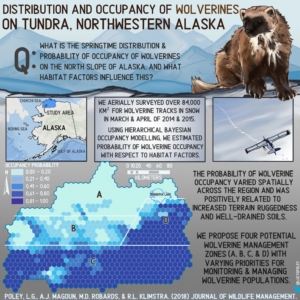
3) Know your audience! The style and contents of your abstract can be fairly general, suitable for most people, or they might be more specific. For example, if you’re using the abstract to present at a conference with your peers or to share on a network of people in your field, you might include more technical terms than if you were presenting to an audience of the public, sharing in the local newspaper, or going to a school. Similarly, different fields might lend themselves to different abstract styles. Someone researching chemical reactions might find a labelled flowchart to be the best for conveying their work, while my research on the geographic distribution of wolverines was easily summarized with a map. Whatever style you choose, make sure it will resonate with your audience through your choice of contents, terminology, and design.
4) If you can’t make one, find someone who can! Graphical abstracts are increasingly in popularity, but the less artistically-minded may see them as out of reach. But don’t despair – there are plenty of excellent graphical abstract artists out there who can help, many of whom are both scientists and illustrators. If you see someone else’s abstract and think it’s awesome, don’t be afraid to reach out and ask if they’re available to make one for you! Generally, the more information you can share with the artist on what you envision the abstract to be, the smoother the design process will go; for example, sharing what you might like to see in terms of content, colours, imagery, and designs with the designer will help them to produce an abstract that fits your needs and vision. Supporting folks in the SciComm and SciArt fields is a great way to get yourself a cool abstract AND help out hard-working artists.
5) Share it… a lot! There’s no point in having a graphical abstract if you aren’t going to use it! Share your abstract (with links to the full article) on social media to maximize its utility. I purposefully design my abstracts in a square format because social media platforms like Twitter and Instagram work best with square images. I also keep in mind what the preview will look like on these platforms – Twitter tends to cut off the top and bottom of images in preview, so I make sure something eye-catching in right in the middle, versus Instagram, which just shows a smaller thumbnail of the whole image. Graphical abstracts can also be included in blog posts, on websites, in presentations and on posters, and even printed out and hung on the wall (how old school). The more you share it around, the bigger an impact your abstract is going to have.
- Another Way? – Interview with Dr Paul Whaley - July 29, 2021
- Is Sci-Hub Science’s Napster? - May 28, 2021
- Music and Education - September 7, 2020
- Interview with Glenn Wolkenfeld – the man behind sciencemusicvideos - July 21, 2020
- Interview with Lucy Poley – Tips to make great graphical abstracts - July 1, 2020
- Hana Ayoob – Talks science comedy, podcasts, and art - April 22, 2020
- Let’s talk about cancer, separating facts and untruths – an interview with Lisa Whittaker of Tenovus - December 16, 2019


Leave a Reply
Want to join the discussion?Feel free to contribute!