Break the mold with a graphical abstract (Luc Cox, February 2015)
Graphical abstracts is one of many ways to adapt scientific communication to a quickly evolving media landscape. Luk Cox, scientific illustrator with a background in molecular biology, has a clear message: it is time for old dogs to learn some new tricks.
For almost as long as we can remember, scientific publishing follows a very rigid and uniform structure. This ‘optimized’ format (title, abstract, introduction, materials and methods, results, discussion, references) is engrained in the brain of every scientist. It is something so obvious that it is not even questioned anymore. Which is strange for scientists, isn’t it?
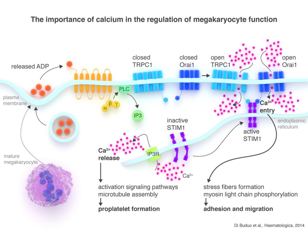
Luckily, every now and then, some scientific journals experiment with ‘new’ ways of publishing research. And indeed they should, because information consumption changed drastically in the last two decades. Most information uptake happens via online media nowadays and we digest the news in little chunks rather than big bodies of text. These innovative journals came up with the graphical abstract, a single and concise visual representation of the presented research, a summary of the main findings of the paper captured in a specially designed figure.
A graphical abstract is certainly not a replacement of the classical way of publishing research, but it is a very welcome addition. However, not everybody in the scientific community is pleased with this new format. It is often seen as extra work without added benefit. As a result, most graphical abstracts are an upgraded version of the conclusion slide of the talk that goes along with the publication. I’m not sure if this very helpful for the perceived quality of the publication.
But change always creates opportunity. However, not for everybody. Most people don’t like change, most people avoid new things and prefer to stick to the methods they know very well. For them change creates a chance for failure and the fear of loss overwhelms them so much that they don’t see the huge opportunity anymore. The innovative scientist, on the other hand, embraces change and is prepared to fail, because she knows that the possibility of failure is the only way to success.
The huge and unique opportunity a graphical abstracts offers to you as a publishing author is the possibility to drive traffic to your research. It is more than a summary of your research. You should envision it as the marketing message, the advertisement of your work. It is your chance to capture your audience’s attention, to make them so interested that they want to read more. It is our moral duty as scientists to communicate the research we perform far and fast, it can save lives and make our world a better place. If we want to succeed we’ll need to adapt our communication to the fast evolving media landscape, including social media platforms. Graphical abstracts are very well suited for this.
The innovative scientist that uses this knowledge and optimizes a graphical abstract to attract the right attention will benefit. Her work will be seen by more people, possibly leading to more interest in her research. This leads to unexpected collaborations, more funding, more citations and recognition. All this accelerates the momentum to get even more opportunities. It works as a positive feedback loop. The innovative scientist values her research important and takes the leap.
And this scientist might be you …
Luk Cox, Ph.D.
is an ex-research scientist that now focusses on helping scientists, students and teachers to ‘visually’ succeed in scientific publishing and communication.
Readings
[1] Jean-luc Doumont, Trees, maps, and theorems
[2] Seth Godin, Purple Cow (This book is not about science, but talks about being remarkable, a must for every graphical abstract or scientist)
[3] Derek Sivers, How to start a movement (short TED talk that explains extremely well how a movement is formed, apply this to graphical abstracts and there you go)
- Claire Price of Crastina receives outreach award from Royal Society of Biology - October 25, 2020
- Agile Science student project at Brussels Engineering School ECAM: “We can’t wait to try it again!” - August 28, 2020
- Create an infographic in the Lifeology SciArt Infographic Challenge - June 16, 2020
- Adam Ruben – The scientist that teaches undergraduate students comedy - March 27, 2020
- Sam Gregson, Bad Boy of Science: “Comedy helps to bridge the gap” - March 10, 2020
- The Coolest Science Merchandise of 2019 - December 16, 2019
- Science Media Centre (UK) offers guide on dealing with online harassment in academia - November 26, 2019
- Agile project management taught to students and researchers at Karolinska Institutet - September 20, 2019
- Stefan Jansson: Improve your credibility! (Crastina Column, September 2019) - September 6, 2019
- The People’s Poet: Silke Kramprich, tech communicator - August 31, 2019


Intresting meeting in Åhus this spring that relates to this: http://aias.au.dk/events/more-than-pretty-pictures/
Thank you so much for that link Jenny, this looks very interesting!
Luk
Thanks for the inspiration to give graphical abstracts another go! I had to submit one for a paper during my PhD and just didn’t know what to do, so it ended up being a sort of figure – not very good.
Q – What software would you recommend for making graphical abstracts? Are there any guides or templates to follow? I feel that would be really useful to many scientists who aren’t particularly artistic in their thinking…
Andrew
Hi Andrew,
Any graphical software is fine to do the job. It doesn’t have to be anything complex. But bear in mind that graphical software is often confused with presentation software, like for example Powerpoint. Not that you cannot make a graphical abstract with it, but there are some (resolution) pitfalls when it comes to printing.
I’m not aware of any templates and think that it is extremely hard to put it in some kind of template. Graphics always mean a certain kind of artistic freedom. In my opinion this is one of the strong points of a graphical representation. It gives you the chance to be different than everybody else (which would be difficult with a template). However, guidelines are very useful in this respect. The main inspiration for this comes from graphic design, there is a lot to learn from this field to improve the way we represent our research. This week there are some post on the Crastina Facebook page to give you a head start. You can also follow my blog to get regular tips and tricks about this subject.
Thanks for your insightful comment!
Luk