Create an infographic in the Lifeology SciArt Infographic Challenge
How do you visualize the theme of Communicating Risk & Uncertainty in an Uncertain World? This is the challenge presented this month by the SciComm network Lifeology.
This interview is a part of Crastina’s current theme Visualization & Graphical Abstracts.
Lifeology is a platform for engaging lay audiences in health-related science via fun and accessible content. We got in touch with one of its key members: the SciComm influencer Dr. Paige Jarreau, currently a Science Communication Specialist for the College of Science at Louisiana State University.

Hi Paige! Tell us a little about the Lifeology SciArt Infographic Challenge!
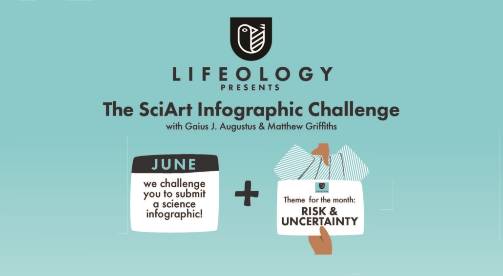
The Lifeology SciArt Infographic Challenge is an opportunity for scientists or anyone interested in communicating science to create their own infographic with help from Lifeology’s growing community of science artists, illustrators and designers. Anyone can participate! You can get started by learning more about the challenge here (includes a themed prompt, tips and advice). We will also be publishing blog posts all month at Lifeology.io featuring cool infographics and behind-the-scenes information about how the creators made them, what things they considered to effectively present scientific data in a compelling and visual way, etc.
Why should early-career scientists who are interested in communication engage in this?
Early-career scientists can struggle to make their mark and get their research out into the scientific community, much less into broader society. Science communication skills are invaluable to being successful in getting grants and promotions, getting research published, and building a research niche that others in your field are aware of. But young scientists are more than ever also helping to open science up to be more inclusive and participatory, by sharing science in more accessible ways and mediums like social media. Learning how to create compelling science visuals (like art-driven infographics!) can help you engage both other scientists and broader audiences in your work.
But creating infographics is difficult and it can be overwhelming to get started. This challenge will help you!
What is your favorite example of explanatory visualization in science?
I love when science and art come together in ways that let a viewer explore the data and information in their own time and way. In other words, it lets the viewer go on a journey of science learning, as opposed to feeling overwhelmed by fast-paced jargon.
- One of my favorite recent projects was a kid’s comic about COVID-19.
- I also love this recent comic/infographic about COVID from Miriam River. It breaks expectations for COVID communications and helps people learn the science of what has become a topic that a lot of people are tired of hearing about.
Please give three pieces of advice to the person who sits down to design an infographic!
I curated some responses from our Lifeology community! Here are tips from Cristina Sala:
1. Identify the key messages you want to communicate with the infographic.
2. Plan an intuitive layout that’s easy to follow, taking into account the media or channel you want to share the final piece on for dimensions.
3. Throughout the illustration process, check back with your key messages often and make sure any piece of art you add is there to support the messages rather than distract or adorn.
- Claire Price of Crastina receives outreach award from Royal Society of Biology - October 25, 2020
- Agile Science student project at Brussels Engineering School ECAM: “We can’t wait to try it again!” - August 28, 2020
- Create an infographic in the Lifeology SciArt Infographic Challenge - June 16, 2020
- Adam Ruben – The scientist that teaches undergraduate students comedy - March 27, 2020
- Sam Gregson, Bad Boy of Science: “Comedy helps to bridge the gap” - March 10, 2020
- The Coolest Science Merchandise of 2019 - December 16, 2019
- Science Media Centre (UK) offers guide on dealing with online harassment in academia - November 26, 2019
- Agile project management taught to students and researchers at Karolinska Institutet - September 20, 2019
- Stefan Jansson: Improve your credibility! (Crastina Column, September 2019) - September 6, 2019
- The People’s Poet: Silke Kramprich, tech communicator - August 31, 2019

