The-best-poster-ever-made interview: James O’Hanlon, Macquarie University
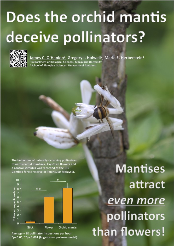
I was quite delighted when I stumbled upon the research poster which you see below the other week. For years, I have searched for the Holy Grail of research posters, and suddenly it was there, designed by the Australian zoologist, researcher & science communicator James O’Hanlon.
Notice the components of the poster, brought together in extraordinary simplicity :
- A gorgeous photo—both beautiful and scary—which also represents scientific observation.
- A title–which is a question.
- A conclusion–which is the answer.
- One graph, providing proof for the conclusion.
- A QR code as the gateway to more information.

Hi, James O’Hanlon! Tell us a about yourself as a scientist and how you designed this “advertising style” poster.
It seems everything these days requires you to get a message across in as little time as possible. Many people (including me) get their news from Twitter in less than 140 characters. YouTube ads have 5 seconds to sell a product before the ‘skip’ button appears. In this super fast digital age so many ideas are presented to us all at once. To handle this, our brains have to act as a filter, quickly assessing everything presented to us and deciding which one we are interested in enough to spend more time thinking about.
A poster session at a conference can be the same sort of experience. Especially at a big international conference you may be standing somewhere in the middle of a maze filled with hundreds of other poster boards. No body is going to go through investigating each and every poster so if you want to get attention you need to get it fast! My aim for this poster was to make something that only needed one quick glance to get the idea across. Hopefully once I had gotten the idea across the people who were interested in what I was researching would take that next step and approach me to ask a few questions.
I had the added benefit of working on a truly spectacular research topic. Never underestimate the power of a photogenic study species! If you think your study species is beautiful then share that love with everyone else. And don’t think that this logic stops and pretty plants and animals, perhaps you have a majestic piece of equipment, a breathtaking density plot, or a jaw dropping flow chart share it with the world. Find that one thing that really excites you about your own work and use that enthusiasm to make a great poster.

James O’Hanlon “studies the behaviour of animals and the wild and wonderful tales behind their ecology and evolution”.
Why should your poster concern the young scientist?
If you’re a postgraduate science student, you are inevitably going to have to give a poster presentation at a conference. Don’t think for a second that this means your research isn’t good enough for an oral presentation, or that you are going to get less exposure by giving a poster presentation. Poster sessions are what you make them, so make them kick ass!
A poster session is your opportunity to sell yourself as a professional. It is an opportunity for one-on-one conversations with your peers and a platform to advertise your skillset. What matters most is how you engage with your audience, the poster is simply a tool to help you do that.
I designed this poster what visual aids I would need to tell my story. My most important graph, a photo of my study animal that helped explain the story. And (most importantly) use as little text as possible. Hopefully this poster will inspire other scientist to take what they think they know about poster design and throw it out the window. My advice is to forget about summarising a manuscript and start thinking about telling a story. And the simplest story you can tell about research is a question, and an answer.
Give three pieces of advice to the team who wants to create a bold, effective poster!
1. The golden rule: Less is more
The worst possible poster is one that consists of huge blocks of text. If I can’t understand what your poster is about with a cursory glance I’m probably not going to bother reading it. The most common feedback I had on this poster came from people simply saying ‘I love it, I don’t have to read anything’.
The fundamental purpose of research is to answer a question. This poster takes that idea to an extreme by simply having two sentences, a question and an answer. It may feel a little weird to streamline your story so much, after all it usually represents several years of hard work. But the poster session isn’t just about the poster, its about you. You have the opportunity to stand next to it and talk as much as you like. Make your poster as succinct and direct as possible, if anyone wants further details they can ask you as many questions as they like.
2. A poster is not a paper
There is an out dated perception that posters have to resemble truncated papers with introduction, methods, results and discussion sections. I have even seen posters with the whole bottom half taken up by references, footnotes and funding acknowledgements. I was horrified to hear that there are some conferences that have strict requirements that posters must adhere to manuscript formats and even specify font types and styles. If you are attending one of these conferences you have my deepest condolences.
At most of the conferences I have been to, the extent of the poster requirements is their dimensions, so the design is a limitless playground for you to work with. Forget about your manuscript and think about your story. What is the story you want to tell and what visual aids do you need to tell it? Go bananas, get creative, and remember your poster is just a tool to help tell your story.
3. Think outside the poster
Your poster presentation doesn’t have to end at the poster. You can use it to spruik your website, twitter feed, crowdfunding campaign, whatever you need! You can bring heaps of other story telling tools with you. I went a bit overboard with this particular poster session and brought an iPad loaded up with extra figures, pictures and videos so that I could present my entire PhD thesis if anyone cared to ask. I’ve seen people brandishing stuffed animals, preserved specimens, even bags of lollies to lure in passers by. If nothing else it could be a nice ice-breaker, so have as much fun with your supplementary materials as you are comfortable.
Dr James O’Hanlon
@jamohanlon
jamesohanlonresearch.wordpress.com/
Flickr Gallery
Footnote: ‘spruik’ is an informal expression in Australian English, meaning ‘promotote; speak for one’s cause’.
- Claire Price of Crastina receives outreach award from Royal Society of Biology - October 25, 2020
- Agile Science student project at Brussels Engineering School ECAM: “We can’t wait to try it again!” - August 28, 2020
- Create an infographic in the Lifeology SciArt Infographic Challenge - June 16, 2020
- Adam Ruben – The scientist that teaches undergraduate students comedy - March 27, 2020
- Sam Gregson, Bad Boy of Science: “Comedy helps to bridge the gap” - March 10, 2020
- The Coolest Science Merchandise of 2019 - December 16, 2019
- Science Media Centre (UK) offers guide on dealing with online harassment in academia - November 26, 2019
- Agile project management taught to students and researchers at Karolinska Institutet - September 20, 2019
- Stefan Jansson: Improve your credibility! (Crastina Column, September 2019) - September 6, 2019
- The People’s Poet: Silke Kramprich, tech communicator - August 31, 2019


Trackbacks & Pingbacks
[…] couple of weeks ago, Mike sent me a link to this interview with ecologist James O’Hanlon, who made this poster (borrowed from this post on […]
Leave a Reply
Want to join the discussion?Feel free to contribute!