Statistical maps tell us about our world
Alhough not much used in lab based research, maps showing statistical data can be very useful when we want to understand the world and the geographical distribution of stuff. Hence, statistical maps are often used in research fields like epidemiology, economics and sociology.
The UK Dpt for Communities and Local Government has presented an excellent overview. Basically there are three types which are more or less self-explanatory:
- colour shaded maps
- proportional symbol maps
- dot maps.
Recently, 40 different statistical maps were compiled on the blog Bored Panda. Here you can learn more about everything from breast size worldwide to the most popular sports in the world. Informative, fascinating and inspiring for everybody interested in information design.

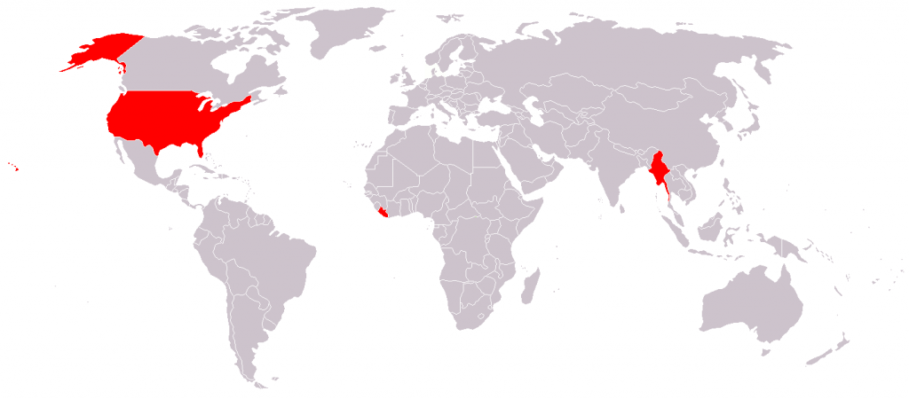
The only countries in the world that don’t use the metric system. Come on, USA – what would e.g. your founding father Benjamin Franklin have thought about this?
- Claire Price of Crastina receives outreach award from Royal Society of Biology - October 25, 2020
- Agile Science student project at Brussels Engineering School ECAM: “We can’t wait to try it again!” - August 28, 2020
- Create an infographic in the Lifeology SciArt Infographic Challenge - June 16, 2020
- Adam Ruben – The scientist that teaches undergraduate students comedy - March 27, 2020
- Sam Gregson, Bad Boy of Science: “Comedy helps to bridge the gap” - March 10, 2020
- The Coolest Science Merchandise of 2019 - December 16, 2019
- Science Media Centre (UK) offers guide on dealing with online harassment in academia - November 26, 2019
- Agile project management taught to students and researchers at Karolinska Institutet - September 20, 2019
- Stefan Jansson: Improve your credibility! (Crastina Column, September 2019) - September 6, 2019
- The People’s Poet: Silke Kramprich, tech communicator - August 31, 2019


Leave a Reply
Want to join the discussion?Feel free to contribute!