Zen Faulkes, Better Posters: “No frickin’ Comic Sans”
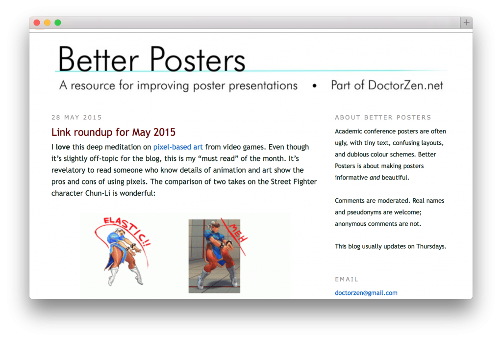
“[The blog] Better Posters is about making posters informative and beautiful”. Meet invertebrate neuroethologist Zen Faulkes at The University of Texas-Pan American. He regularily shares his advice with the scientific community on how to integrate typography, layout and infographics in the service of the reader.
This is the second follow up interview for the Crastina Column this month which dwells on what scientists can learn from designers.
http://betterposters.blogspot.se
 Tell me a little about your website Better Posters!
Better Posters is a blog about making and giving poster presentations at academic conferences. I started it because when I went looking for poster presentation resources, everything I found was very short and static. I saw an unexploited niche for a poster blog, which could be ongoing and more dynamic. It’s been running for six years now.
Why should it consider the early career scientist?
Posters presentations are one of the best ways to level the playing field between early career scientists and established researchers at a conference. Everyone gets the same wall space, and everyone is rubbing elbows in the space between posters. You never know when you might meet one of your science heroes or science crushes!
There are more opportunities for one-on-one interactions than oral talks, and with that comes so many more chances for people to give you advice. An oral talk might be a better sales pitch for a finished project, but a poster is better for improving a project or hatching new schemes for the next project.
Which are your three most important pieces of advice for young scientists preparing a research poster?
1. Take your time. Making a poster is complicated. You have data to plot and text to write, and it all has to fit and flow into a limited space. It’s not something you want to try to knock out in an afternoon.
2. Edit. People often try to include put too much stuff on a poster, particularly written text. A poster might be the first time they’ve tried to pull a project together into a single document, so they overthink it and write too much. They haven’t had the distance to figure out what is essential. Scientists are also very comfortable with words, and often want to show every hard-fought datum that they have gathered. The results can look like someone vomited a journal manuscript on a tabletop. You have to be willing to cut stuff out, and you have to be ruthless about it.
3. No frickin’ Comic Sans. Academics seem to love Comic Sans. I see talks and posters using it at every conference I go to. But it’s such a bad look — and I’m not saying that because I don’t like the hand drawn style. I love comic book lettering! But there are much better comic book fonts out there. Comic pros would never use Comic Sans. It was never meant for high resolution displays, so Comic Sans always looks clunky on a poster. It’s better suited to a kid’s birthday party invitation than a professional document. When you use Comic Sans, your poster becomes about the typeface and not of the science.
- Claire Price of Crastina receives outreach award from Royal Society of Biology - October 25, 2020
- Agile Science student project at Brussels Engineering School ECAM: “We can’t wait to try it again!” - August 28, 2020
- Create an infographic in the Lifeology SciArt Infographic Challenge - June 16, 2020
- Adam Ruben – The scientist that teaches undergraduate students comedy - March 27, 2020
- Sam Gregson, Bad Boy of Science: “Comedy helps to bridge the gap” - March 10, 2020
- The Coolest Science Merchandise of 2019 - December 16, 2019
- Science Media Centre (UK) offers guide on dealing with online harassment in academia - November 26, 2019
- Agile project management taught to students and researchers at Karolinska Institutet - September 20, 2019
- Stefan Jansson: Improve your credibility! (Crastina Column, September 2019) - September 6, 2019
- The People’s Poet: Silke Kramprich, tech communicator - August 31, 2019


Leave a Reply
Want to join the discussion?Feel free to contribute!